How To Design a Textured Business Card in Photoshop
23
May'12
 irenethompson80
Member since:
Feb 2012
While you can actually pay business card printer to use special textured paper, for your creative business cards, there is a way to use Adobe Photoshop to simulate that kind of textured style easily.
Final Image

Step
01
 irenethompson80
Member since:
Feb 2012
While you can actually pay business card printers to use special textured paper, or even more exotic materials for your creative business cards, there is a way to use Adobe Photoshop to simulate that kind of textured style easily without the added cost. In this tutorial, we will talk about the process of how you can design a textured style business card layout using Adobe Photoshop. Even if you are just a novice in Adobe Photoshop, you should be able to easily follow.
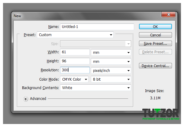
1. The very first step is of course, opening Adobe Photoshop and creating a new document. Setting this up is crucial as it will determine the compatibility of your business card design for full scale printing. The standard settings for vertical type business cards are listed below, but you may want to refer to your business card printer for their preferred settings.
a. Width: 61mm (55mm+6mm), the extra 6 mm are for the bleeds.
b. Height: 96mm (90mm+6mm) , the extra 6 mm are for the bleeds.
c. Resolution: 300ppi (minimum recommended for high quality printing)
d. Color Mode: CMYK

Step
02
 irenethompson80
Member since:
Feb 2012
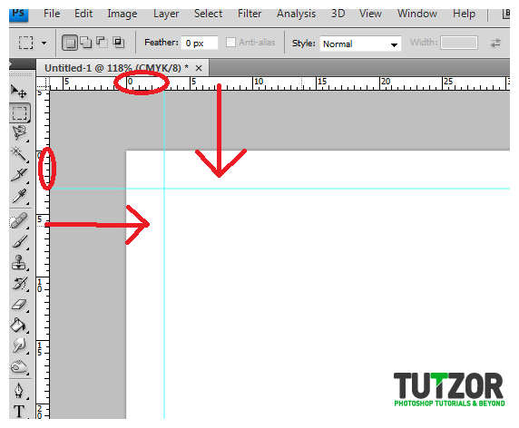
2. Once open, we need to setup the business card guides. First, f you do not see Rulers in your document press CTRL+R. With the rulers visible, drag a guideline from the ruler to the canvass by just clicking on it and dragging the mouse. As you drag the guideline, pay attention to its ruler location and approximate a 3mm distance from the edge. If you are having trouble seeing it, try zooming in by holding the ALT key and using your Middle Mouse Wheel to see closer. Set it just like the image below. Do this for all the sides of the business card design.

Step
03
 irenethompson80
Member since:
Feb 2012
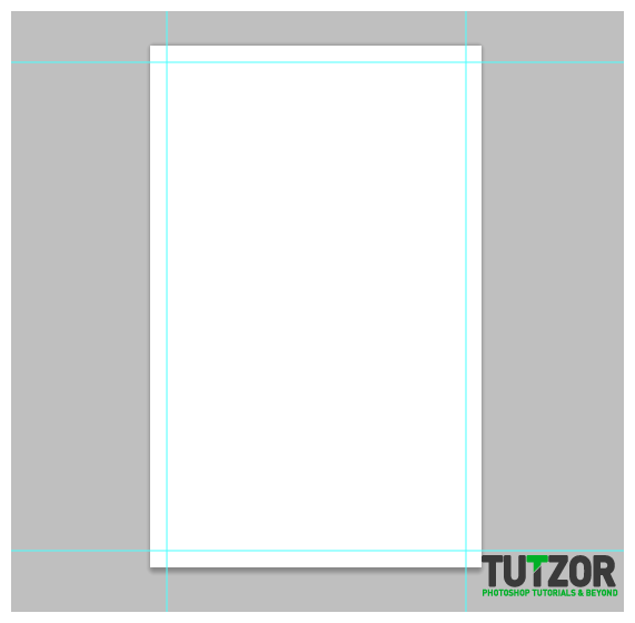
3. The guides should look like this:

Step
04
 irenethompson80
Member since:
Feb 2012
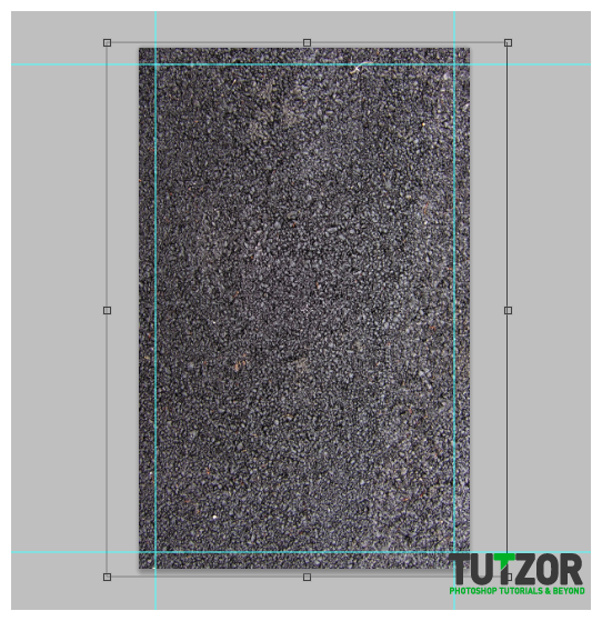
4. Great! Now we are ready for some textures. For this particular business card, we are going to use an asphalt texture. So we paste in a nice free asphalt texture like so. Note that we scaled the size down of course to fit the business card. Also, we placed the background outside the bounds of our guides. This helps with the bleed as any minor discrepancies in cutting will not matter because of the excess space.

Step
05
 irenethompson80
Member since:
Feb 2012
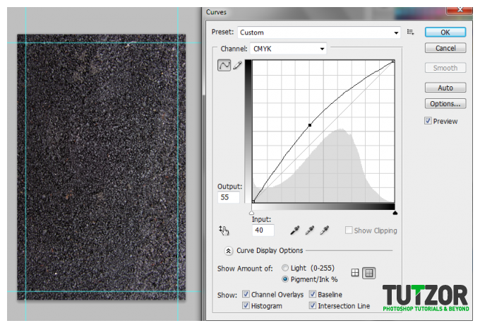
5. Now, we darken our texture a bit. To do this, go to Image ->Adjustments -> Curves. In the window that opens, adjust the curve graph so that it looks a bit like the image below. We are just darkening the texture a bit so that our text and other graphic elements will stand our later.

Step
06
 irenethompson80
Member since:
Feb 2012
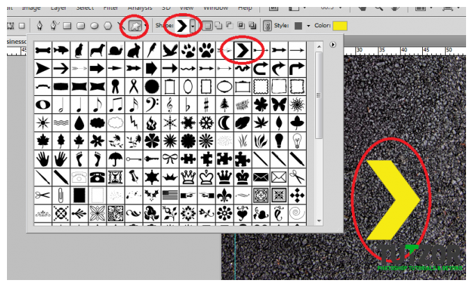
6. Good. Now we will add some accents to our asphalt texture. Using the custom shape tool we add an arrow shape into our canvass. To match the guidelines you see on the roads, we used a yellow color for the shape here.

Step
07
 irenethompson80
Member since:
Feb 2012
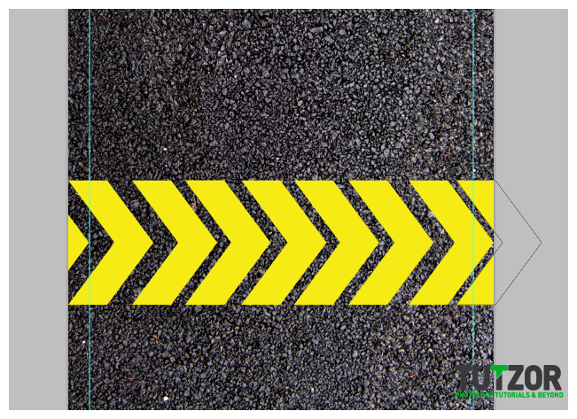
7. Now, press CTRL+J several times to duplicate our shape. Move the duplicates around to get a line of them across our design. Do not worry about the spaces too much, we will correct that later.

Step
08
 irenethompson80
Member since:
Feb 2012
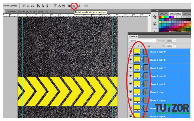
8. Now, select all the shapes we created by CTRL clicking on them on the layers panel. (Alternatively you can use the SHIFT key, click on the topmost layer and then click on the bottom most layer). Once selected go to the attributes bar and click on the option “Distribute Horizontal Centers”.

Step
09
 irenethompson80
Member since:
Feb 2012
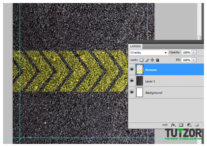
9. Once done, merge all the layers into one, by right clicking on them and selecting “Merge Layers” in the context menu that appears. Change the blend mode of this newly merged layer to overlay to get a nice painted on effect on the asphalt texture.

Step
10
 irenethompson80
Member since:
Feb 2012
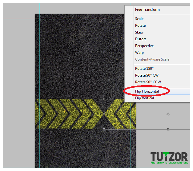
10. Next, duplicate our merged arrows layer by pressing CTRL+J. Flip it by pressing CTRL+T, right clicking on the duplicate and selecting “Flip horizontal”. Position both arrow layers creatively as you see fit. You can even rotate them diagonally if you want. Here we just placed them both pointing to an area like so.

Step
11
 irenethompson80
Member since:
Feb 2012
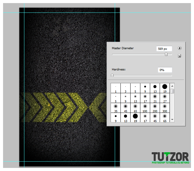
11. Great! Now, create a new layer on top of everything by pressing CTRL+SHIFT +N. Using a soft and large black brush, add some darker patches on the borders. This allows the eyes to see more emphasize on the center of the business card design. Once done here, NOW would be a good time to save your document as a TEMPLATE. Once saved as a template, save this again as the front or back of your design, whichever you want to do first.

Step
12
 irenethompson80
Member since:
Feb 2012
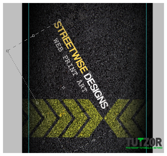
12. Now here we want to do the company or description side of the business card. So we type in the name of the business as well as its supposed products using the type tool. We have positioned them creatively to add a more interesting and distinct effect.

Step
13
 irenethompson80
Member since:
Feb 2012
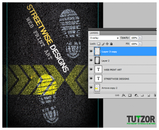
13. Next, we create a new layer and we use some shoe print brushes from here () to add a more streetwise effect. We then change the blend mode of this layer to Overlay as well. This finishes up the front part of our business card describing the services. Just save this front part as such.

Step
14
 irenethompson80
Member since:
Feb 2012
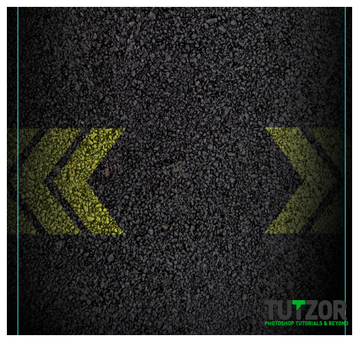
14. Now, load the template file we created earlier. Save it as a new document marked as the back of the business card. We now flip the positions of our arrows so that it matches the front part. We now leave some space at the center for the text.

Step
15
 irenethompson80
Member since:
Feb 2012
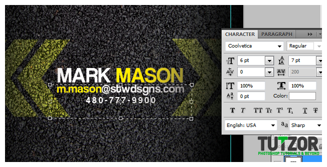
15. Then, type in the important business card information for the back using the type tool. Make sure to vary the color and sizes of the font for a more creative finish.

Step
16
 irenethompson80
Member since:
Feb 2012
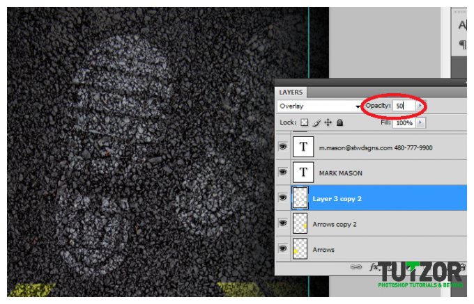
16. Now, we just do the same thing with the shoe print accents. We just create a new layer and paint up some shoe print shapes. We change the blend mode to overlay, AND we reduce the opacity to 50%.

Step
17
 irenethompson80
Member since:
Feb 2012
FINAL IMAGE
Great! With that we have now finished our textured and creative business card design! Hope you learned a lot from the different tricks that we did.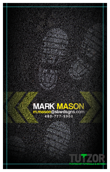
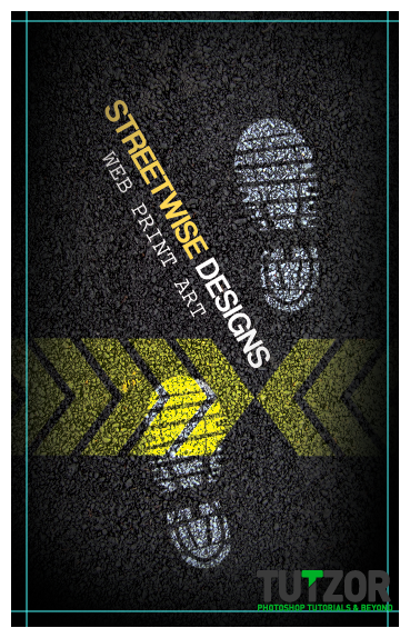
Great! With that we have now finished our textured and creative business card design! Hope you learned a lot from the different tricks that we did.


Step
18
 irenethompson80
Member since:
Feb 2012
Hope you enjoy the tutorial! Swing by PrintPlace Tutorials to find more of this.
