Grunge Portfolio Layout Tutorial
23
Mar'11
Member since:
Mar 2011
Step
01
Member since:
Mar 2011
....okay enough with the talking :)
Let's start the actual work.
Fire up Photoshop and create a new document, about 750px wide and some 800 high.
Or...well..whatever size you need your site to be.
Set your Foreground color to #200900 and taking the Paint Bucket Tool (G), fill the first layer with it :)
Next, go here and download this beautiful set of grunge brushes: http://fav.me/dar40k because we're going to use them now :D
Okay, load them in Photoshop and creating a new layer above your solid color one, start brushing around, especially around the center.
Then after 2-3 clicks change that brush shape with another from the set..brush again..then change again..so on. Careful no to over-do the brushing :)
When you consider you have brushed enough, go to Filter--->Sharpen--->Sharpen and..well...err..sharpen..the grunge brushes? xD
Yeah, sharpen them 3 times in total.
Then take the Dodge Tool, set it to a soft, round brush of approximately 60px in diameter, set its Range to Highlights and Exposure to about 7%, with Airbrush CHECKED.
Dodge here&there randomly, to create the illusion of lighting ^_~
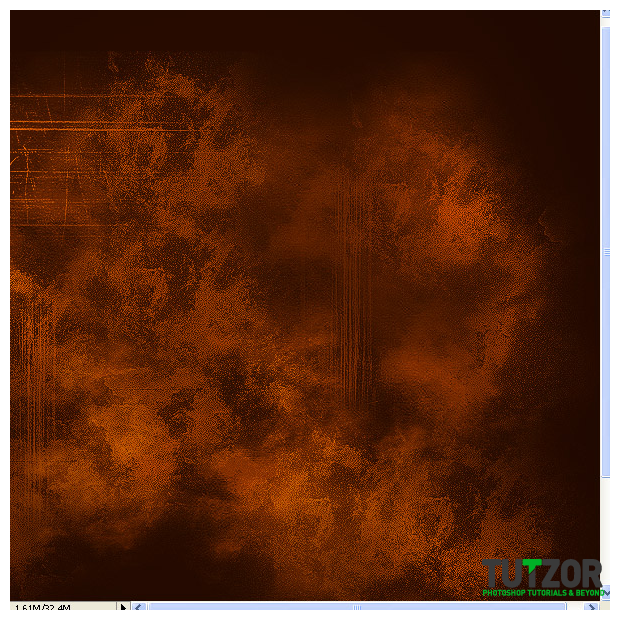
Alright! At the end of all this strife, we should have something similar to this (only part of the 750x800px canvas shows in the screenshot below, if you want to see the whole canvas please download the Step1 attachment above) :

Step
02
Member since:
Mar 2011
That looks good, but it could look even better :D
Merge the grunge brushes layer with the solid color one and call it "Background". Then, duplicate this Background layer and on the copy go to Layer--->Layer Mask-->Reveal All.
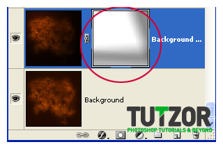
Set your color to a light gray, say #5a5a5a and taking the Gradient Tool (G), set it to Reflected Gradient, Foreground-to-Transparent. Drag on the Layer Mask on the right and bottom-right sides so as to enhance the illusion of light coming from the top-left corner.
This is how my Layer Mask looks right now, and please see Step2-attachment file above for how the Background looks at this moment.

Step
03
Member since:
Mar 2011
Oki, now let's give our Background&Background copy layers some color adjustments :D
Go to the bottom of your Layers Palette and find the "Create new fill or adjustment layer" icon. Click it, then choose "Hue/Saturation".
Give it these settings:
---Hue: +7
---Saturation: -10
---Lightness: 0
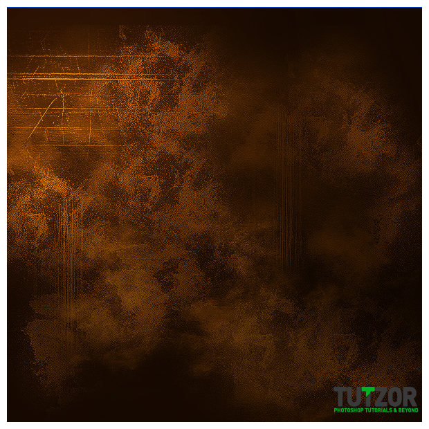
After that, your canvas should look something like this (showing below just the central portion) :

Step
04
Member since:
Mar 2011
Nice :)
Now to recap: we should have 3 layers so far in our Layers Palette: Background, Background copy with a layer mask on and a Hue/Saturation adjustment layer ^_^
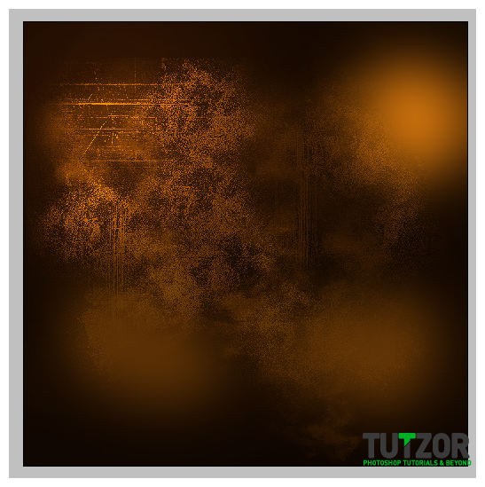
Set your Foreground color to #d9790e and create a new layer above all your others. Take the Gradient Tool, leave it to Foregrund-to-Transparent but change to Radial Gradient, and drag on the new layer for small distances in a few points, so as to get something like this (I zoomed out in the image below to allow fullview) :

Step
05
Member since:
Mar 2011
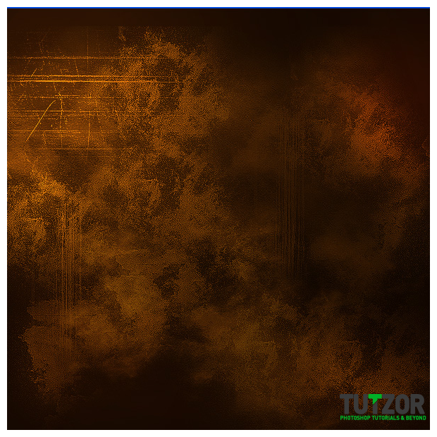
Set this layer to "Color Dodge" mode and lower its Fill to about 60%. Name it "Light Effects".
You should be getting something like this in the end:

Step
06
Member since:
Mar 2011
So far so good :)
Now let's take care of the top bar ;)
Alright now, take the Rectangular Marquee Tool and drag from the top-left corner so as to create a rectangular selection covering about 60px in height and all the width of the canvas.
Create a new layer above all your tohers and then set your Foreground color to #291102
Take the Paint Bucket Tool (G) and fill your rectangular selection with this color.
Alright! Now name this layer "Base Top Bar". We'll need it later to have easy ccess to the selection of that area :)
Mmkay, now create a new layer above your others and set your Foreground color to #260e01
Name your layer "Shadow Bar Top" and set it to Multiply mode, with a Fill of about 60%.
Go to your Layers Palette, and Ctrl(Cmd on Mac)+click on the "Base Top Bar" layer's thumbnail, to obtain its selection.
Then go to Select--->Inverse to invert it.
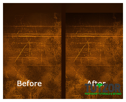
Next, take the Gradient Tool set to Foreground-to-Transparent, and to Linear Gradient, and drag from the selection's top downwards a bit, so that you get a result similar to this (see left&right for before&after comparison shots) :

Step
07
Member since:
Mar 2011
Alright, way to go! :D
Now we'll create the base for our sexy glassy top bar ^_~
Make a new layer above all your others and name it "Top Bar Gradient". Lower its Fill to about 65%. Obtain a selection of your "Base Top Bar" by Ctrl(Cmd)+clicking on its layer thumbnail in the layers palette like before.
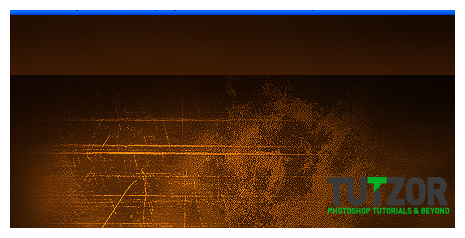
Set your Foreground color to #4c2006 and taking the Gradient Tool (G) set to Linear Gradient, Foreground-to-Transparent, place your cursor at the base of the selection and drag upwards for a bit, so that you get a result similar to this (make sure your gradient fades out before it reaches the top) :

Step
08
Member since:
Mar 2011
Alright, now one more thing to do: see above how I said to make sure your gradient fades out before reaching the top of the canvas? Here's why: we'll make an additional, artistic border at the very top.
So...!
Set your Foreground color to #4d2106 and create a new layer. Move this layer so that it is under the "Top Bar Gradient" one in the Layers Palette. Name it "Top Artistic Border".
Now take the Retangular Marquee tool and drag as you did for the "Top Bar Gradient"...from the top-left corner..all width of the document...BUT! only a height of about 20px.
Once you have that selected, take the Gradient tool and drag on the "Top Artistic Border" layer from the left-most side...to..about the middle.
So that you get something like this:


Step
09
Member since:
Mar 2011
Alright! :D
Now comes the fuuuun part :)
Click on your "Top Bar Gradient" layer to make it your active one. Then obtain its selection by the Ctrl(Cmd) method we made earlier. Okay...now go to the "Create new fill or adjustment layer" icon at the bottom of the layers palette and choose Levels.
Give it these settings: Channel: RGB. Input Levels: 0/3,81/214
Set it to Linear Dodge mode, and lower Fill to about 78%.
Okay, next obtain its selection AGAIN, this time choose a Brightness/Contrast adjustment layer.
Give it these values: Brightness: +20 and Contrast: +43
Lower the layer's Opacity to 63%
Last Adjustment layer, it will be a new Brightness/Contrast. So: obtain the "Top Bar Gradient" selection again and choose a Brightness/Contrast adjustment layer.
Give it these values: Brightness: +29 and Contrast: +48
Then click OK and lower the Opacity to about 50%.
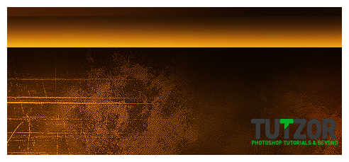
This is what it should look like now..or close:

Step
10
Member since:
Mar 2011
Mmkay. Let's now give our top bar a nice shiny gloss :D
Alright then, create a new layer above all your others. Name it "Gloss Top Bar". Set your Foreground color to #faf3ef
Then set your layer to Linear Dodge mode, and lower its Fill to about 25%.
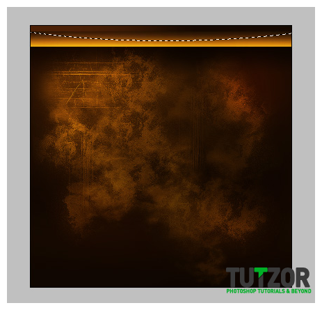
Okay....next, take the Elliptical Marquee Tool and create a looong..elliptical selection (you will have to zoom out for that) like so (this is viewed at 50% zoom) :

Step
11
Member since:
Mar 2011
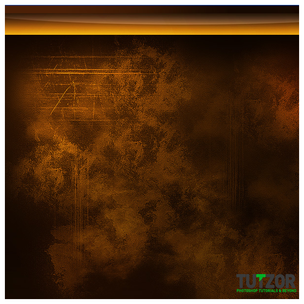
Now take the Gradient Tool (G), same settings as before, and drag lightly from the bottom of the selection to its top.
In the end, you should have a result similar to this:

Step
12
Member since:
Mar 2011
Glow time!
Create a new layer..yes, of course above all your others xD Name it "Glow Top Bar".
The obtain the selection of the Top Bar Gradient layer, and then set your Foreground color to #f55b06
Take a huge, 200px soft, round brush and click once, approximately in the center of the selection. Then lower the brush size to about 120px and set your Foreground color to # and click, again approximately in the center, so that you get something like this:


Step
13
Member since:
Mar 2011
Next, set the layer to Color Dodge mode and lower its Fill to about 25%...and you should get something similar to this:


Step
14
Member since:
Mar 2011
Now let's take care fo the borders our Top Bar will have okay? ^__^
Create a new layer on top of all others. Name it "Frame Top Bar". Then take the Rectangular Marquee Tool and select approximately the area of the glossy bar, like in image 1 below--->
Then set your Foreground color to #96410d and on the new layer go to Edit--->Stroke--->4px and Center. Duplicate the layer, hide the copy (we'll use it in the next step). Deselect.
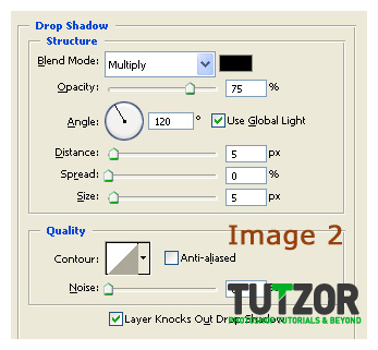
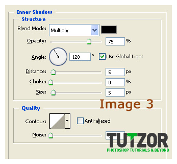
Okay..now on the visible "Frame Top Bar" go into the layer's blending styles and give it these settings (images 2 and 3) :



Step
15
Member since:
Mar 2011
Kay, good! Remember the "Frame Top Bar copy" duplicate we hid earlier? Okay, un-hide it now :D
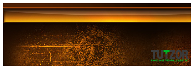
Make sure that this is your topmost layer at the moment, and then take the Rectangular Marquee Tool....and select the left, right and bottom sides of the "frame copy". Then press Delete. Oh my gosh look! They vanisheeeedd.. o____o
Hehe, oki now move it a couple of pixels upwards, and ta-daaam, your piccy sould look like this now:

Step
16
Member since:
Mar 2011
Moo-vin' on ! :D
One more step to go until we're done with the top bar, yepee xD
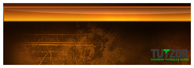
Take the Magic Wand Tool and click on the "Frame Top Bar" layer (the one with the layer styles) to make it your active layer. Click with the Magic Wand Tool inside it, so as to obtain a rectangular selection. Set your Foreground color to #742d01 and on a new layer above ALL your others drag with the Gradient Tool (G) (same settings for it as before) only ths time drag from TOP to BOTTOM of the selection.
Then set your layer to Linear Dodge and lower its Fill to about 60%. Oh and name this "Top Bar Overglow". Weird name ish weird :|
Anyway, you should get something like this:

Step
17
Member since:
Mar 2011
Okaaaay, now you can safely group all the top bar-related layers into a large group :) Name the group 'Top Bar"..haha.
Now! Let's move on with the actual content boxes ^_~
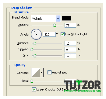
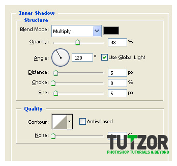
Set your Foreground color to #321300 and create a new layer on top of all your others and take the Rounded Rectangle Tool (U) and set it to Shape Layers. Also, set its Radius to about 10 px. Drag to create a medium-sized rounded rectangle...and then give these layer styles to it:
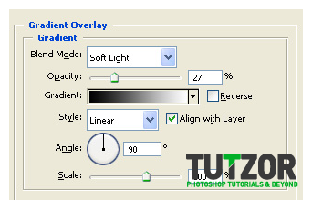
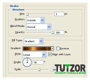
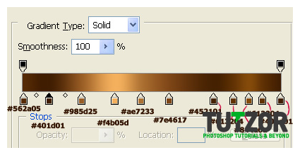


Step
18
Member since:
Mar 2011
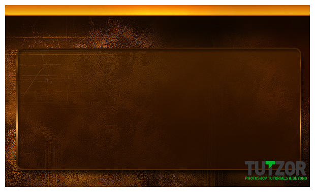
...name the layer to "Gallery" and lower its Fill to about 75%
Now you should have something like this:

Step
19
Member since:
Mar 2011
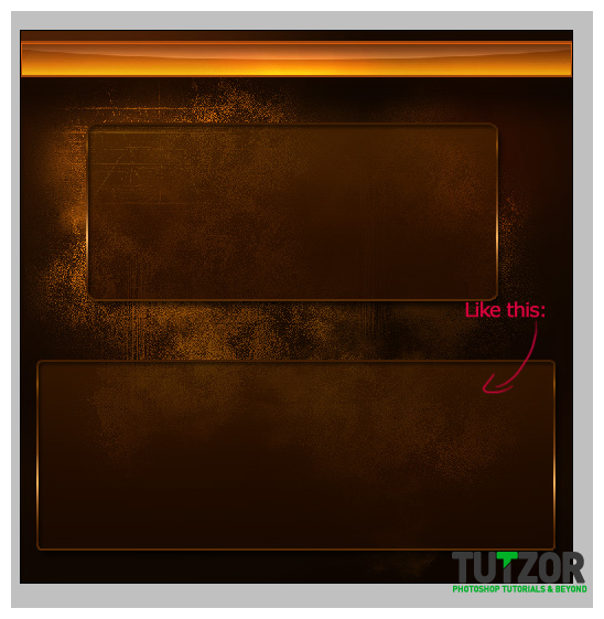
Now create a new layer above the Gallery one and follow the same process to create the main text area. Name it "Text Area" xD
Like so:

Step
20
Member since:
Mar 2011
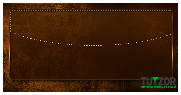
Mmkay create a new layer on top of all your others and set it to Color Dodge and lower its Fill to about 50%. Name it "Highlight Boxes".
Set your Foreground color to #fae6ab and the Ctrl(Cmd)+click to obtain the selection fo the "Gallery". Then take the Elliptical Marquee Tool (M) and set it to Intersect with Selection mode.
Drag to obtain such a selection at top:

Step
21
Member since:
Mar 2011
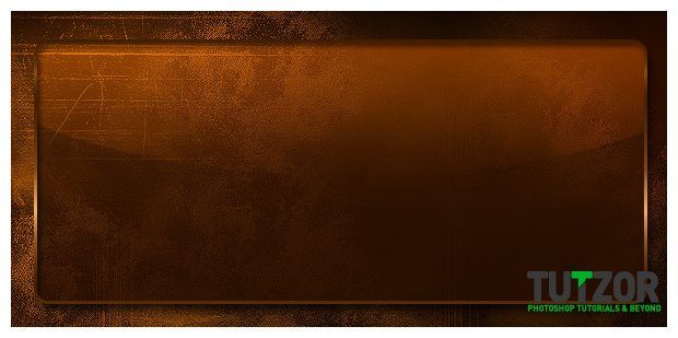
Take the Gradient Tool (G) with the same settings as before and drag from top to bottom of the selection. So that you get something like in image 1 below--->
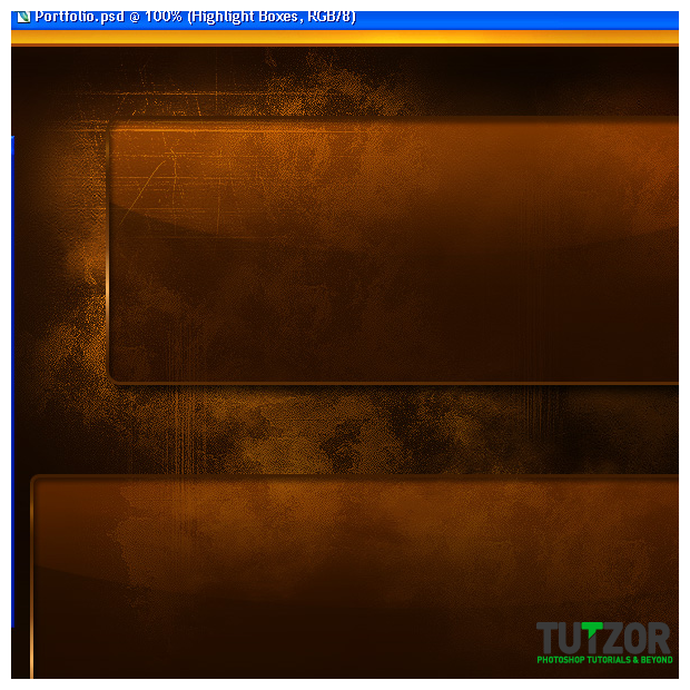
Then obtain the selection of the "Text Area", and on the same "Highlight Boxes" layer repeat the actions in the previous step with the Elliptical Marquee Tool, then add the gradient....and you should get a similar result for the "Text Area" box as for the "Gallery" one. Look below at picture 2:


Step
22
Member since:
Mar 2011
Mmmkay, now let's seperate the content, right?
Create a new layer, move it under the "Highlight Boxes" one and set your Foreground color to #ec7c0e.
Then, take the Line Tool (U) and set its Weight to 1px. On the new layer we just created drag to create a vertical line (which we will use to separate our showcased graphics in the "Gallery" ) ...okay so drag holding down Shift key -to help you get a straight line- for ...well...about 2/3 of the height of the gallery, like so:
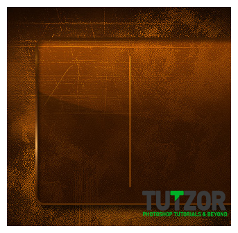

Step
23
Member since:
Mar 2011
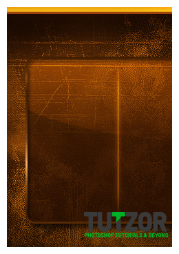
Alright, then go to Filter--->Blur--->Motion Blur, set it to Angle: 90 and Distance ...about 40px.
Good! :D
Now duplicate the layer and move the copy under the original. On the copy, go to Filter-->Blur--->Gaussian Blur of about 1,5...something. See what looks best for you. Click OK to confirm, then if needed duplicate the blurred layer...and/or blur it again.....until it looks good :)
Merge the copy and the original line layer, name this resulted layer "Separator". It should look something like this:

Step
24
Member since:
Mar 2011
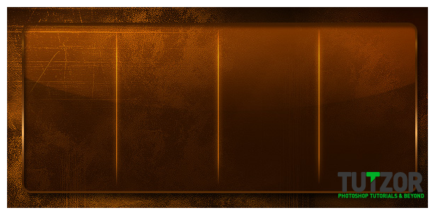
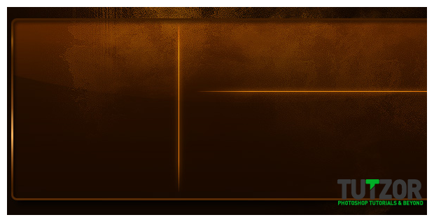
Sweet, now what we need to do is duplicate this "Separator" layer 3 times.....move two of the copies to the right and the last copy down (to the "Text Area" ).
Press Ctrl(Cmd) + T to resize vertically the last copy (so that it goes all the way down across the "Text Area" module)
Take one of the copies and duplicate it...then on the well..err..copy-of-the-copy go to Edit--->Transform--->Rotate 90 degrees CW. Transform this to fit the remaining width of the "Text Area"....then you can merge all the Separator-twins into one layer...and..call it "SeparatorS"!..with an "S" hehehe :D
Like so:


Step
25
Member since:
Mar 2011
Uhkay, now let's take care of the different types of buttons :)
First, the main row of buttons, attached to the "Text Area" part :)
Create a new layer above all your others and set your Foreground color to #6f9b08
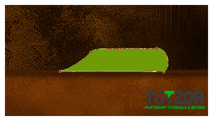
Pick up the Pen Tool (P) and set it to Shape Layers mode. Then create a shape similar to this (here I zoomed in at 200% so that you can see better) :






Comments
Re: Grunge Portfolio Layout Tutorial
The gradients which is added to the borders looks awesome ..... gr8 job...
Re: Grunge Portfolio Layout Tutorial
Thank you. This looks amazing.
Re: Grunge Portfolio Layout Tutorial
thanks very