Minimalistic but dramatic poster style using Photoshop
04
May'12
 irenethompson80
Member since:
Feb 2012
We will show you how you can use subtle color and blending styles to create a more dramatic and minimalistic poster style. CMYK color mode is also needed if this is for a four color printing process. You may also apply this design style to flyers, simply adjust the dimensions and you’re good to go.
Final Image
Step
01
 irenethompson80
Member since:
Feb 2012
One of the typical modern design styles used today is the minimalistic style. However, for most minimalistic styles, the result has a tendency to be cold or lacks the proper intensity of emotion. In this tutorial, we will show you how you can use subtle color and blending styles to create a more dramatic and minimalistic poster style that is not cold and clinical like others make it. Just follow the steps below and learn how you can do this.
1. First you will want to setup the background. Open a new document in Photoshop and set it to poster dimensions. Use 300ppi as resolution if you mean this for real printing. CMYK color mode is also needed if this is for a four color printing process. You may also apply this design style to flyers, simply adjust the dimensions and you’re good to go.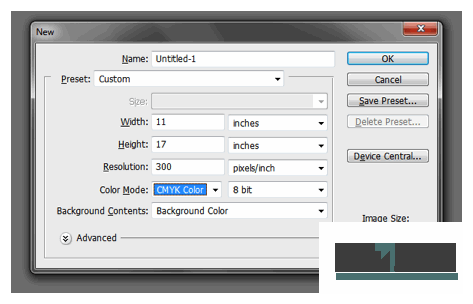
1. First you will want to setup the background. Open a new document in Photoshop and set it to poster dimensions. Use 300ppi as resolution if you mean this for real printing. CMYK color mode is also needed if this is for a four color printing process. You may also apply this design style to flyers, simply adjust the dimensions and you’re good to go.

Step
02
 irenethompson80
Member since:
Feb 2012
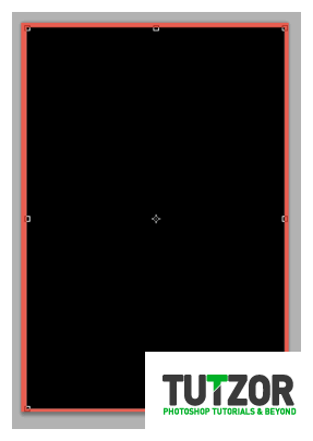
2. Now with a new document open, first fill in the background with your theme border color. In this example, we are using this color (#eb7265). Then, create a new layer by pressing CTRL+SHIFT+N. Fill this with black. Resize our newer layer so you see the background act as a border.

Step
03
 irenethompson80
Member since:
Feb 2012
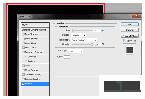
3. Double click on the black layer to get to the layer styles of this layer. Then click on Stroke. Use a 4px white stroke for this layer to act as another sub-border. Change the blend mode to color dodge for an enhanced effect.

Step
04
 irenethompson80
Member since:
Feb 2012
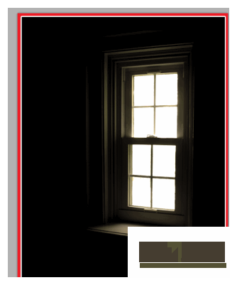
4. Now, we paste in our main feature image, a window. We position it off to the side to make way for the text elements later.

Step
05
 irenethompson80
Member since:
Feb 2012
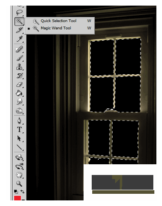
5. First, we cut out the white areas of the window as we are going to put something behind it to make the design more dramatic. TO do this, simply use the Magic wand tool to easily select the white rectangles. If your own chosen image has a more complicated feature to be removed, you can either use the polygonal lasso tool or the magnetic lasso tool to select the areas. Cut the selected areas up by pressing the backspace or delete key.

Step
06
 irenethompson80
Member since:
Feb 2012
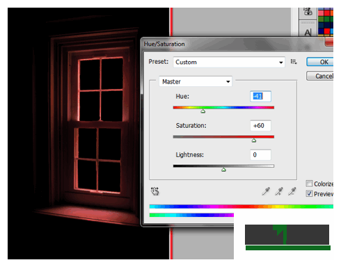
6. Now, with this window layer selected, go to Image -> Adjustments -> Hue/Saturation. Adjust the Hue and Saturation values until the image matches the color for our theme (mainly close to the border color).

Step
07
 irenethompson80
Member since:
Feb 2012
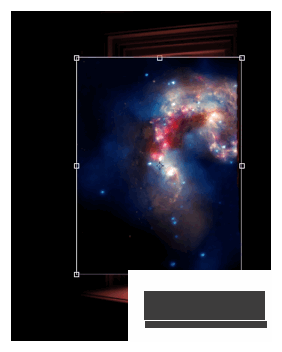
7. Now, paste in a dramatic or amazing image into your document. Here we used a wonderful image of a galaxy from NASA.

Step
08
 irenethompson80
Member since:
Feb 2012
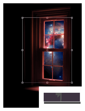
8. Then, send the new image layer behind our window layer. Remove the excess of the image by simply erasing that part with an eraser tool.

Step
09
 irenethompson80
Member since:
Feb 2012
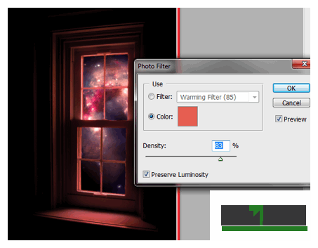
9. Next, we will try to add the theme color to the galaxy image, without compromising too much of its main colors. To do this select the galaxy image layer. Then we go to Image -> Adjustments -> Photo Filter. Using color as your mode and choose the color of our background. Adjust the density to a high level of around 70-85%, but do not go all the way to 100% so that you preserve some of the colors of the image.

Step
10
 irenethompson80
Member since:
Feb 2012
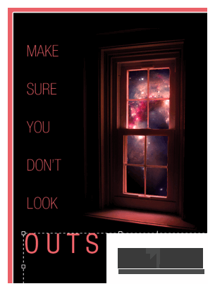
10. Now, we type in the main title and message of our poster. Just use the Text tool to do this of course. Make sure though that you choose an appropriate font style. Since we are going for a minimalistic poster, use sans serif fonts. Do not use serif fonts with extra flourishes or tails. Here we used Helvetica and Helvetica LT.

Step
11
 irenethompson80
Member since:
Feb 2012
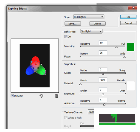
11. But, we are not finished yet. Create a new layer on top of all other layers by pressing CTRL+SHIFT+N. Fill the new layer with white. Then go to Filter -> Render -> Lighting Effects. In the window that opens, change the style to “RGB Lights”. Adjust the RGB light locations to cover a large part of the poster. Press OK once done.

Step
12
 irenethompson80
Member since:
Feb 2012
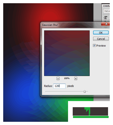
12. You will then see a black layer with your RGB lights. Go to Filter -> Blur -> Gaussian Blur to make the lights fuzzy. Use a 120 value for the Radius Pixels.

Step
13
 irenethompson80
Member since:
Feb 2012
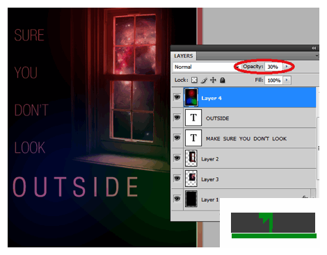
13. Reduce the opacity of this layer to around 30% so that you see our original poster design behind. You will see that you get a nice colored effect over our poster.

Step
14
 irenethompson80
Member since:
Feb 2012
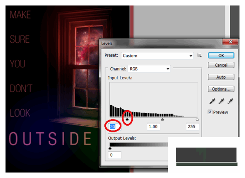
14. Now, with this lighting layer selected go to Image -> Adjustment -> Levels. Change the black input value to around 50-70 to lessen the effect of the dark parts of this layer.

Step
15
 irenethompson80
Member since:
Feb 2012
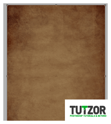
15. Finally, we add some texture to the whole poster design. We got a nice grunge paper texture for free from bittbox here. We pasted it into our poster as the top layer.

Step
16
 irenethompson80
Member since:
Feb 2012
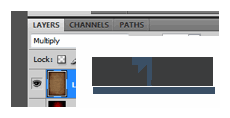
16. Next, change the blend mode of this texture to “Multiply” and reduce its opacity to 80%.

Step
17
 irenethompson80
Member since:
Feb 2012
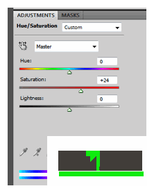
17. Finally, go to Layer -> New Adjustment Layer -> Hue/Saturation. This should be on top of the texture layer. Add a +24 for saturation.

Step
18
 irenethompson80
Member since:
Feb 2012
FINAL IMAGE
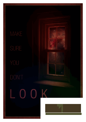
The final result is a minimalistic but very dramatic poster design
The final result is a minimalistic but very dramatic poster design

