Tutzor web 2.0 style design - PART 1
28
Aug'08
 Cpotorac
Member since:
Aug 2010
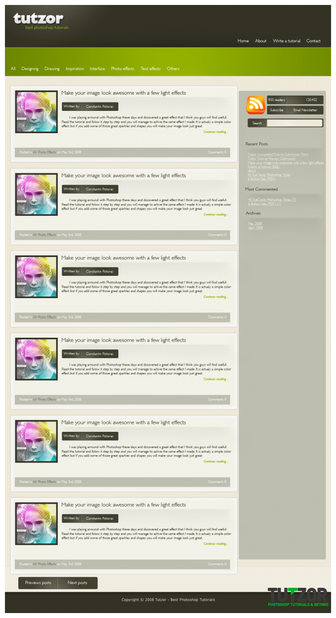
Here is a new and improved look of the Tutzor website. Also you should learn a lot from this tutorial.
Now it's time to do your own website layout. Don't forget to read about various webhosting types and providers so you'll know which one will work perfectly for your website. Enjoy!
Final Image
Step
01
 Cpotorac
Member since:
Aug 2010
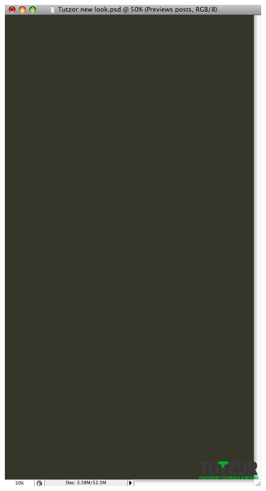
I will start off with a new document 1024×1906. And fill the document with #333225.

Step
02
 Cpotorac
Member since:
Aug 2010
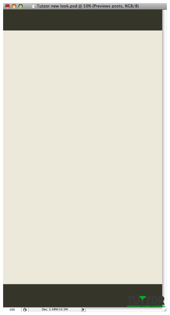
Next we will use the Rectangle tool and make as shape as I did and also use a light color. I used #eee9d9.

Step
03
 Cpotorac
Member since:
Aug 2010
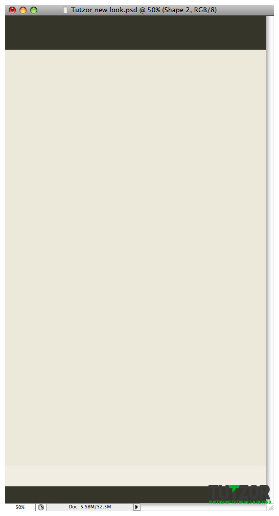
Go to the bottom of the page and make another shape as in step 2 but this time use a lighter color than the first one. I used #f1eee1. Also make sure this layer will be lower than the one is step 2. (this small shape will be behind the big shape).

Step
04
 Cpotorac
Member since:
Aug 2010
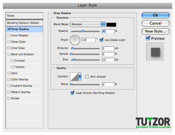
For the shape we just created in step 3 use these settings for the blending mode.

Step
05
 Cpotorac
Member since:
Aug 2010
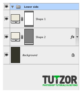
Make a new folder and make sure he is over the other layers. Name it Lower Side. What we will make here are: add some text and make some details.

Step
06
 Cpotorac
Member since:
Aug 2010
For the details you need to zoom in to the place where the big shape and the small shape intersect. Here we will make 2 strips of 1 pixel. To do this use the Line Tool and make sure it is set to 1 px. Use these colors: #a6a38b and #ffffff and make something like I did. Also I will add the copyright text.


Step
07
 Cpotorac
Member since:
Aug 2010
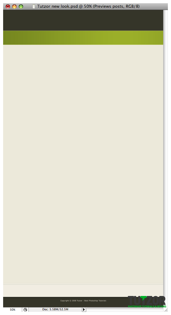
Now that we are done with that side we need to make the menu of this website. I like it simple and clean. Also I will make it on top. So let us move to the top of the website. This is what we will do:

Step
08
 Cpotorac
Member since:
Aug 2010
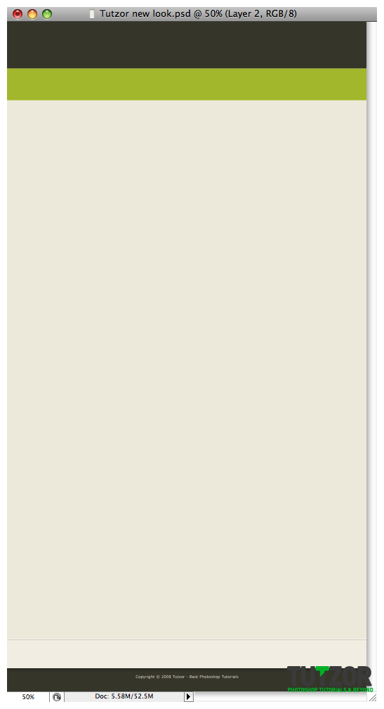
To make this you need to first make a new document and name it category. Here will be displayed the category of each tutorial. This folder will need to be on top of all the other layers. Now make a new shape in that folder and use this color #9bb800.

Step
09
 Cpotorac
Member since:
Aug 2010
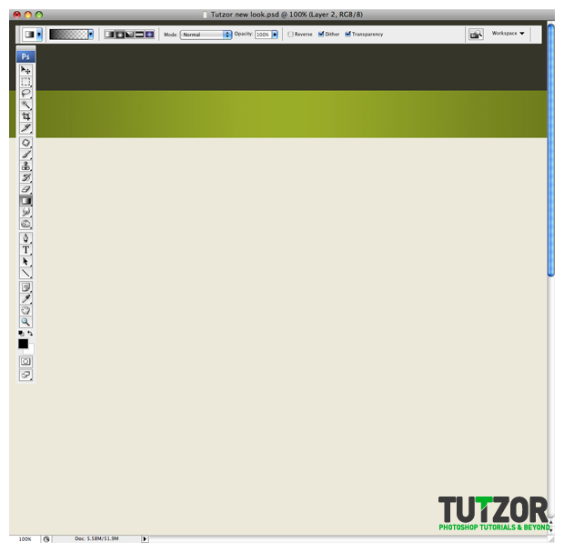
Next make a new layer over the green shape. Here we will make a gradient to make the category bar a little better.
Ctrl + Click on the green shape thumbnail to make a selection and make sure you are on the new empty layer now.
Using the Gradient Tool with the Black color as the foreground to transparent and the Radial Gradient, click and drag over the shape. Make something similar to what I did.

Step
10
 Cpotorac
Member since:
Aug 2010
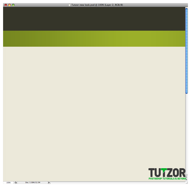
Now set the gradient to Opacity 50% and to Multiply.

Step
11
 Cpotorac
Member since:
Aug 2010
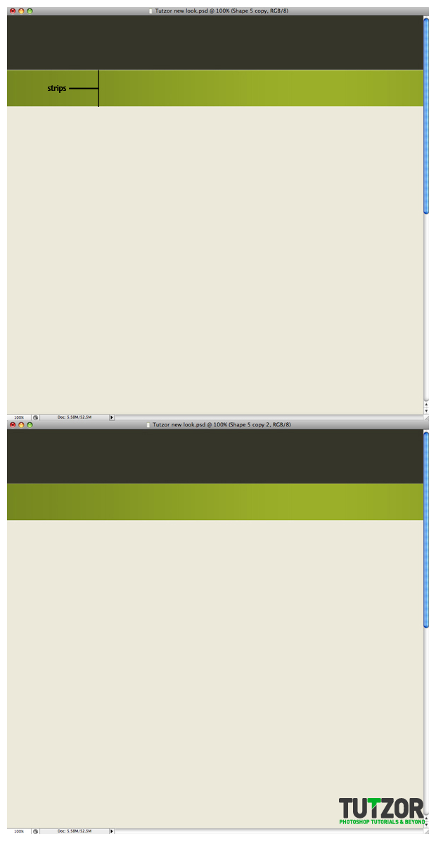
Next are 2 strips just as we did with the lower side. This time we will add 2 similar white strips as seen on the image below. After that change the above one to Opacity 40% and the other to 70%.

Step
12
 Cpotorac
Member since:
Aug 2010
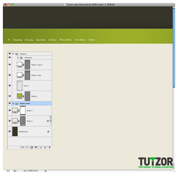
Add the categories and we are done with this side. Make a new folder into the Category folder and make sure it is over the other layers in this folder. Here you will add your text

Step
13
 Cpotorac
Member since:
Aug 2010
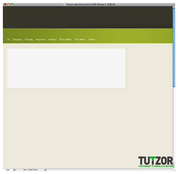
Now I will start to make the shapes where the tutorials will be listed. As I said I like it to bee simple and that is why we will try and make this look as simple as possible and also look good.
Start with a new folder that will be over the other layers. Name it Tutorial.
Using the Rounded Rectangle Tool with a radius of 5px make a shape like mine. Color used: #f5f5f5.

Step
14
 Cpotorac
Member since:
Aug 2010
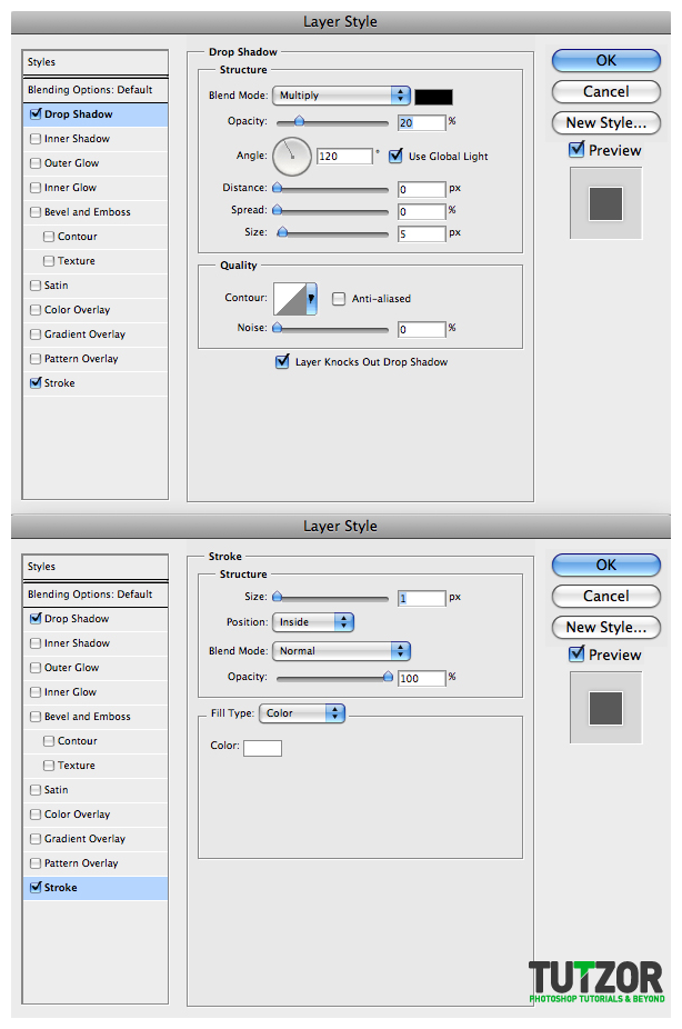
Now use these settings for the blending options.

Step
15
 Cpotorac
Member since:
Aug 2010
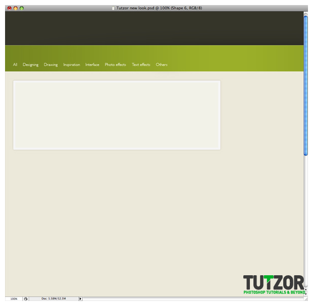
Make a new shape inside the shape on step 13. This time, use this color: #f2f2e8. Here will go all the content.

Step
16
 Cpotorac
Member since:
Aug 2010
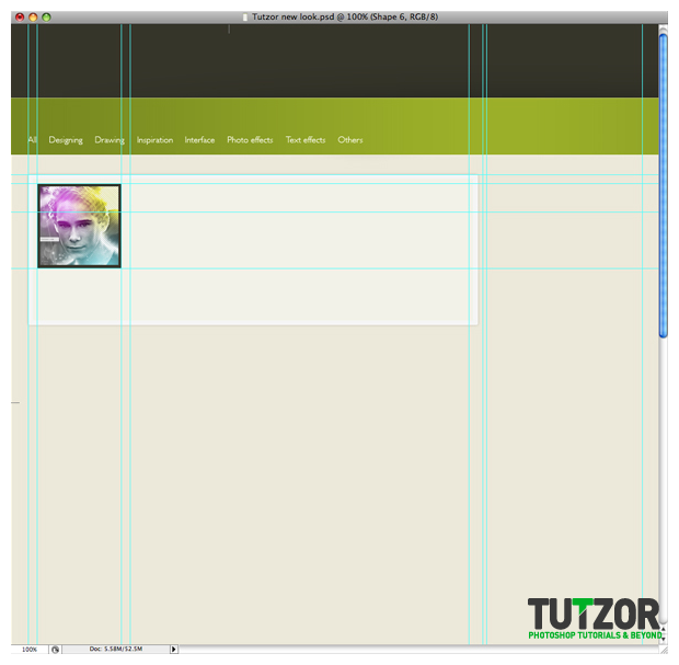
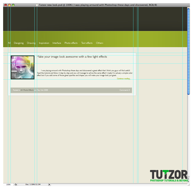
First add your tutorial thumbnail. I suggest you use the guidelines from now on.

Step
17
 Cpotorac
Member since:
Aug 2010
Next I will add some introduction text, comments, tutorial title and other useful text.

Step
18
 Cpotorac
Member since:
Aug 2010
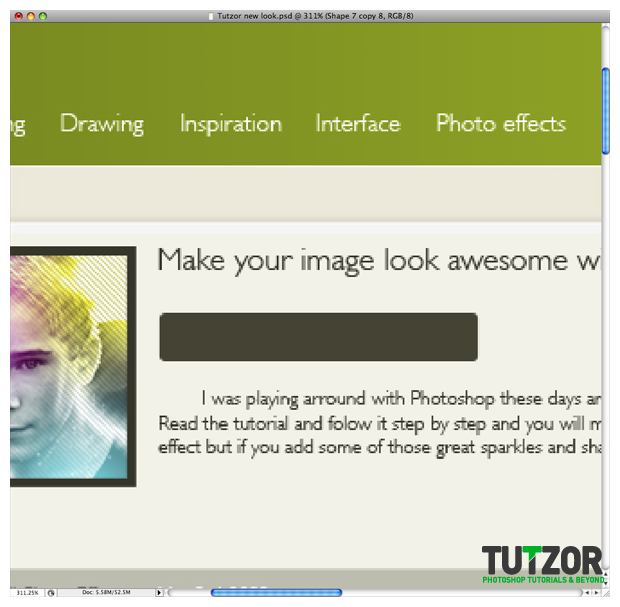
I will insert the tutorial author into a new shape. This step will show you how to make it.
First of all use the guidelines and establish the right place for it. Now using the Rounded Rectangle Tool draw a shape as I did and fill it in with #434130.

Step
19
 Cpotorac
Member since:
Aug 2010
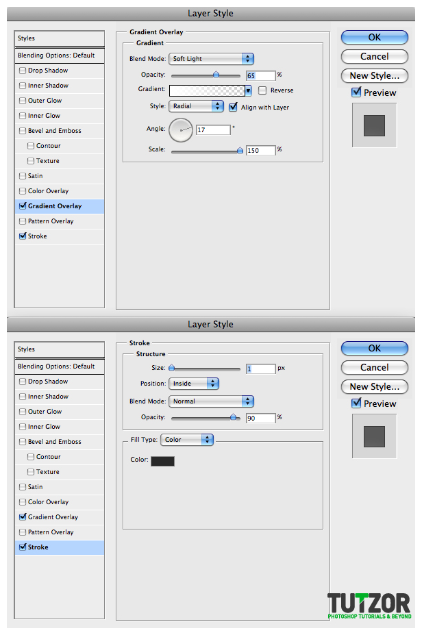
Use these settings for the blending options:

Step
20
 Cpotorac
Member since:
Aug 2010
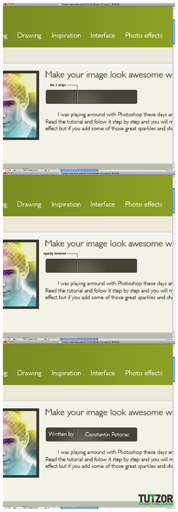
Make 2 strips as I did, one black and one white. Make the strips 50% Opacity and add your text.

Step
21
 Cpotorac
Member since:
Aug 2010
Now I want a nice separator between the tutorial name and the rest of the text.
Make a new layer and make a selection. Use the gradient tool with black color and Linear Gradient and make something similar to mine. Also in a new different layer make a white gradient just like the black one.
Get those 2 gradients close together. Leave just a little gap between them. Next make a white thin strip and place it as I did.
Merge the strip and the gradient layer. Now with the eraser tool set to 0 Hardness and make it real big, just erase the sides of the shape to make it blend in with the background.
And for the final step, to make it blend in better, just bring the Opacity lower.


Step
22
 Cpotorac
Member since:
Aug 2010
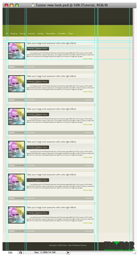
Duplicate the Tutorial folder and position them on the page. Make sure they are all aligned and organized.

Step
23
 Cpotorac
Member since:
Aug 2010
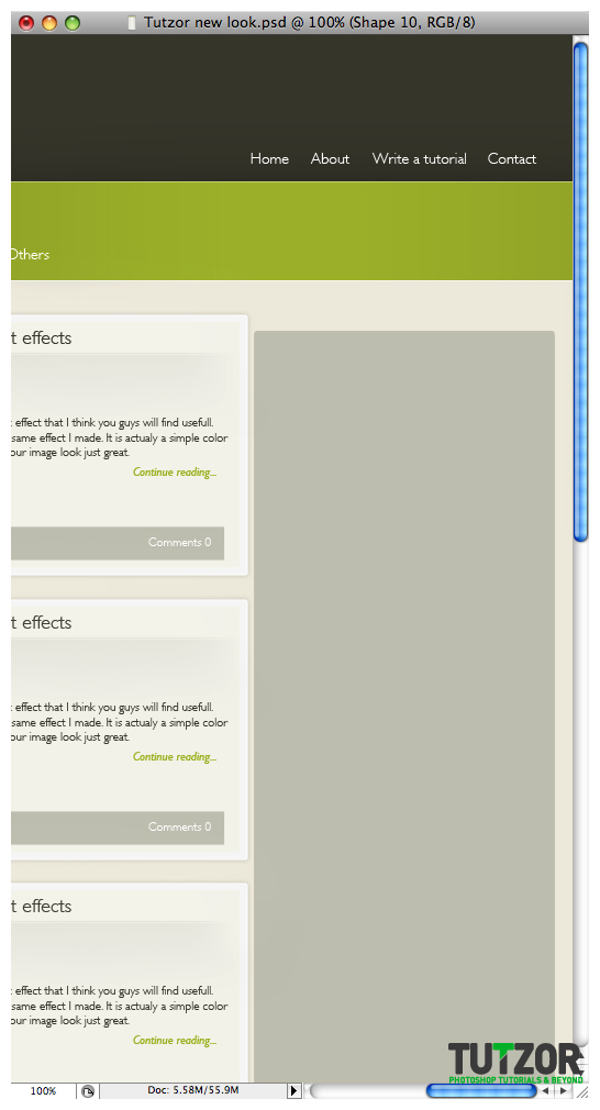
Next is our right side. Here is the place where we will put a lot of links, news and important stuff.
Start with a new folder. This folder will go behind the Tutorial folders.
Name this one Right side and start with a new shape. Use the Rounded Elliptical Tool with 5px and this color: #bebeaf.

Step
24
 Cpotorac
Member since:
Aug 2010
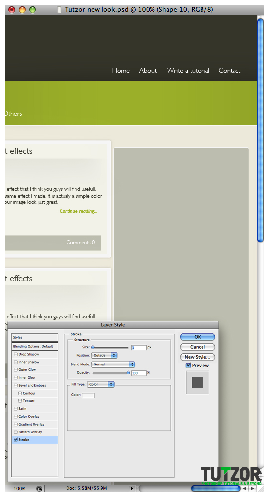
For the Blending options use these settings:

Step
25
 Cpotorac
Member since:
Aug 2010
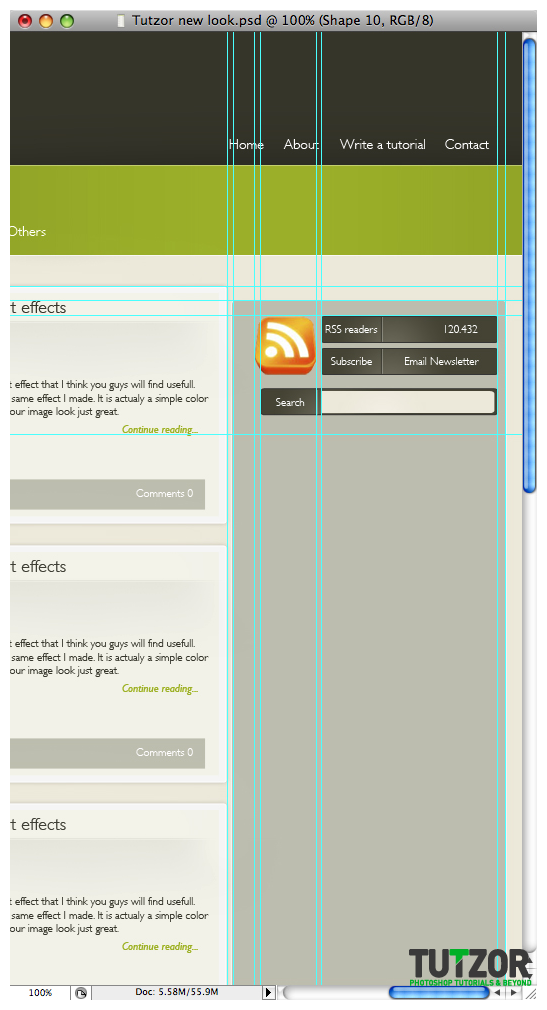
Using the same shape as we did for the author shape in Step 18 use that shape here to make something similar to what I did. These will stand for the RSS and Email Newsletter.







Comments
Re: Tutzor web 2.0 style design - PART 1
this is a great tutorial ive really find it easy to understand this
Re: Tutzor web 2.0 style design - PART 1
Excellent Tutorial that gives you amazing creative work for your websites.
web design company
Thanks for u r information
its very useful..........