Create a Star Wars Themed Media Player - Part 2
14
Mar'11
Member since:
Mar 2011
Page two of the Create a Star Wars Themed Media Player.
Please first view Page 1.
Final Image
Step
26
Member since:
Mar 2011
Now duplicate this line ...many........maaaany...maaa-hahaha--ny times.
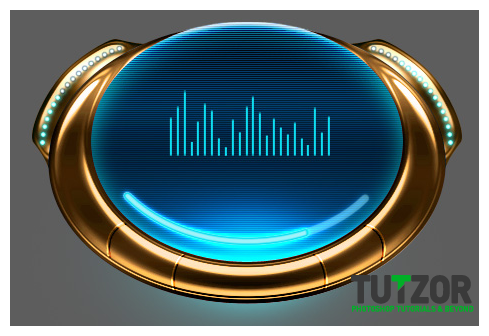
Move each duplicate a bit more to the right than the previous line (you will have to zoom in for this). Make SURE that they all start from the same immaginary horizontal line...I mean..well look below and you'll see what I mean. See how their base sides are all at the same level?
Now the trick to making a nice, realistic equalizer is that each line is a different height than the others. So after you've aligned all the lines take each one and press Ctrl(Cmd)+T to scale it vertically...by increasing its length or reducing it. Like so:

Step
27
Member since:
Mar 2011
Now you can safely merge them all into one layer. Name it...well.."Eqializer Top Part". Why top part? Because we're going to make a bottom part too, in the next steps :)
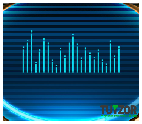
To add a sweeter touch to our Equalizer, we''ll now make a new layer above the"Equalizer Top Part" one and take the Line Tool again, zoom in a whole lot and draw smaaaall, very small bits of line, which we'll place about 1px over each large equalizer line...like so (here shown at 200% zoom) :

Step
28
Member since:
Mar 2011
Good, now let's merge this layer with the "Equalizer Top Part" one.
Next, we'll need to go to the "Song Progress Slider" layer, right-click on it and choose Copy Layer Style...then return to the Equalizer layer and right-click-->Paste Layer Style.
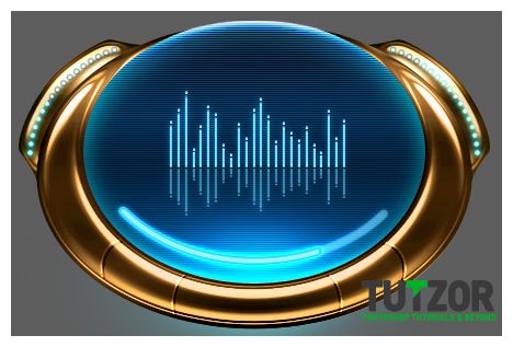
Duplicate the "Equalizer Top Part" layer and re-name the duplicate to "Equalizer Bottom Part"....then go to Edit-->Transform-->Flip Vertically and flip the bugger on its head :D
Yey!
Now move it downwards so that you only have 1px distance between the top part and the bottom part.
Press Ctrl(Cmd)+T to transform it, and scale it a little on the vertical....and then lower its Opacity to about 50%.
You should be getting something like this:

Step
29
Member since:
Mar 2011
Kay, good! :)
Now let's do the text ;)
Go to DaFont and download the "Distant Galaxy" font...here: http://www.dafont.com/sf-distant-galaxy.font
Install it to your computer and then return to Photoshop, create a new layer and move it so that it is the first layer above your "Screen" group.
Now go and type in the name of the song using that Distant Galaxy font we just downloaded..remember to type it using the #0fdef1 Foreground color ^___^
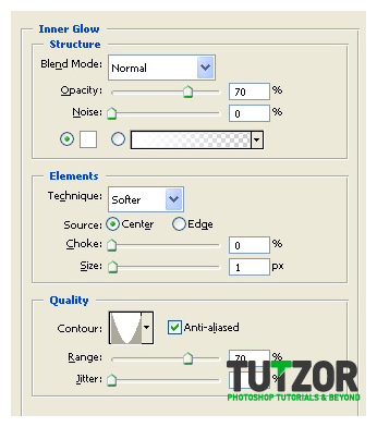
Aaand...give it these layer styles:
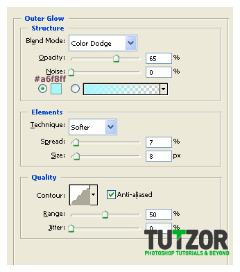


Step
30
Member since:
Mar 2011
Set your text layer to Color Dodge mode......so we can see the scanlines through...it IS a hologram after all haha...
Now follow the same process to add the timer somewhere between the Equalizer and the Progress Slider. Since I'm not liking much "Distant Galaxy"'s numbers look, I'm using the font Voya Nui for the numbers ;)
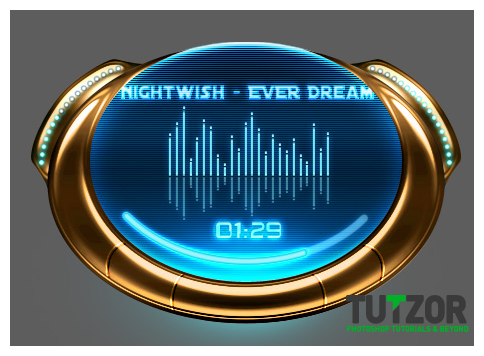
Good, now it should look somewhat like this:

Step
31
Member since:
Mar 2011
Nice..now it's time to work on the buttons.
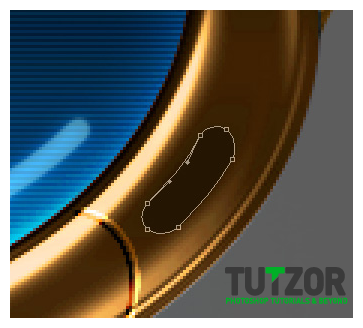
Take the Pen Tool, set it to Shape Layers, set your Foreground color to #241502 and draw a shape like this (here at 300% zoom) :

Step
32
Member since:
Mar 2011
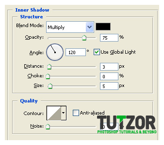
Now give it these layer styles (the gradient is the same we used for the "Body Player" layer) :
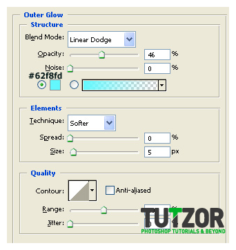
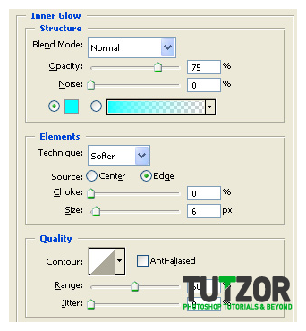
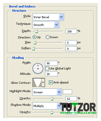
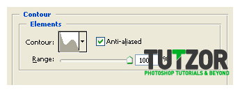
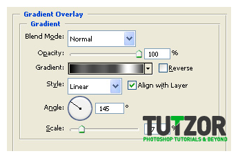


Step
33
Member since:
Mar 2011
Good...now obtain a selection of this shape layer and give it a Color Balance of:
Midtones: +46...+3...-44
Highlights: +32...-2...-43
Shadows: +15...0...-27
With Preserve Luminosity checked.
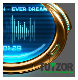
Kay once that done, obtain the selection again and this time give it a Brightness/Contrast of: Brightness: +17 and Contrast: +7
Now you should have a button similar to this:

Step
34
Member since:
Mar 2011
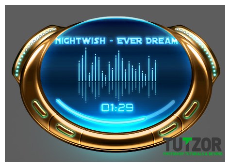
Mmkay, now you can group these 3 layers into one Group..call this group "Button 1". Duplicate this group 3 times and move the 3 copies around (rotate, flip, whatever you need) so you get them aligned like in the picture below. Re-name the groups to "Button 2".."Button 3"..and "Button 4".
Also, pay attention that you will have to change the Angle of the gradient overlay for each of the 3 duplicated shape layers! Here are the Angle values I used:
Button 1: Angle of 145
Button 2: Angle of 121
Button 3: Angle of 60
Button 4: Angle of 45
Good...now our player looks like this:

Step
35
Member since:
Mar 2011
Now let's give our buttons a function huh?
I'm using the Voya Nui font for this, you can use whichever :)
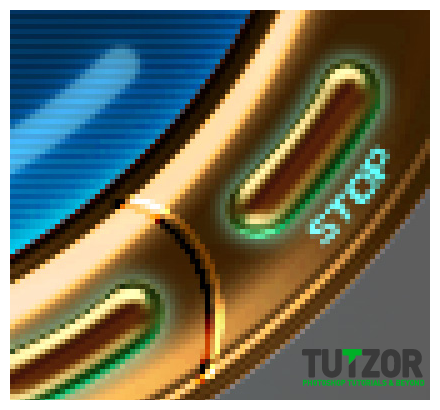
Set your Foreground color to #69ffff and write on a new layer on top of all your others, in a small sized text..say.."STOP".
This will be our rightmost button....
So then go to the "Create Warped Text" button at the top-right of your screen and give it an Arc..Horizontal..-11.....setting.
Then rotate the text and scale it to fit it like so:

Step
36
Member since:
Mar 2011
....and give it these layer styles:
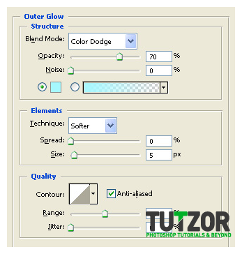
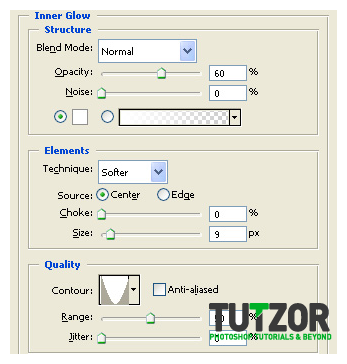


Step
37
Member since:
Mar 2011
Repeat the process for the "Button 4" (the button which is symmetrical to "Button 1", but on the left-hand side of the player).
Let's name this button..say..."Prev"..from previous track :)
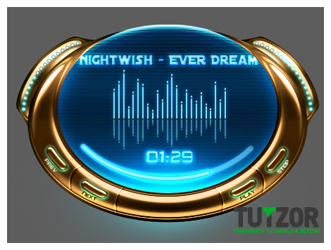
Duplicate the two text layers we just made above and hide their "Inner Glow" layer styles. Also, change their text color to #3d2002 and then rotate each of them and move them so that they can name the two inner buttons. Say....let's name the one on the right "Play" and the one on the left "Next".
Good, now you should have a result similar to this:

Step
38
Member since:
Mar 2011
Time to boost it up :D
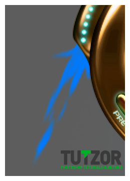
So! Create a new layer right under all you other layers (except the background..of course...:P ) and set your Foreground color to #0079fb and taking a hard, round brush with a small diameter, create the base shape of the booster flame.
Like so:

Step
39
Member since:
Mar 2011
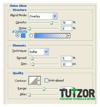
Now set the layer to Overlay mode and lower its Opacity to about 60%. You can also use a Smudge Tool set to a soft, round brush with a Strength of about 60% to smudge the tips of the booster into realistic flame-y like structures. You can keep using the smudge tool for other layers too during the whole booster-creation process, wherever you have choppy edges..etc :)
Give it this Outer Glow layer style:

Step
40
Member since:
Mar 2011
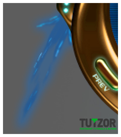
Next, set your Foreground color to #14dff2 and take a small 2px or even 1px brush and on a new layer brush lighter details. Set the layer on Overlay as well. Like so:

Step
41
Member since:
Mar 2011
Oh ..shoot...we're kinda running out of steps here...so here's what we'll do: I'll write the text part first, and then post a series of pictures. Each picture will have a corresponding number and paragraph of txt :)
So:
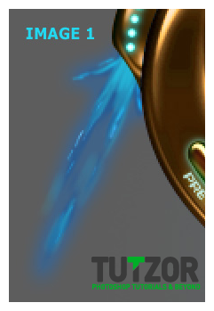
Image 1:
Create a new layer above the booster-related layers you have so far and set your Foreground color to #23d8f0. Then take a 3-4px brush and brush m0ar details ...especially the booster part which is closer to the metal, to the source you know? Like so: ...(see image 1 below)
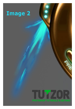
Image 2:
Good, now set this layer to an Opacity of about 70%.
Then set your Foreground color to #30fee1 and on a new layer draw more light closer to the source. You know, just like in a real fire: the flames which are closer to the wood/coal/etc are brighter ^__~
Again, you can use that Smudge Tool.
Like so: (see image 2 below)
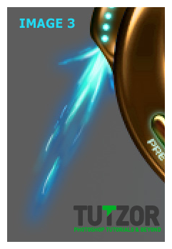
Image 3:
Duplicate the last layer and give it a Filter-->Blur-->Gaussian Blur of about 4,5.
Then create a new layer above the duplicate and set your Foreground color to #e4fcfb. With a small 1-2 px brush brush the lightest part of the booster. Like so (see Image 3) :
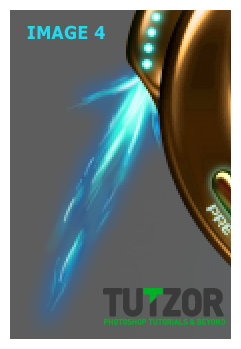
Image 4:
With a 1px brush, same Foreground color as before, brush some residual sparks here&there. Just thiiiin, short lines, like so (see Image 4) :
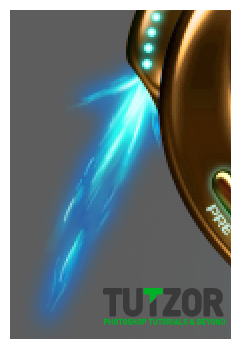
Image 5:
Group the layers we have for our Boster so far into a Group.
Then duplicate this Group once, and press Ctrl(Cmd)+E to merge the copy. Place the merged copy over the other Booster layers, set ot to Overlay mode and lower its Fill to about 70%.
Like so (Image 5 below) :


Step
42
Member since:
Mar 2011
Now let's make a new layer above our Booster-related ones (but still make sure it is WITHIN the Booster group, you know? We'll need it later.
Set your Foreground color to #67fbf5.
Take a soft, round brush of about 5px in size, and then go to the Brush palette in the top-right corner of the screen and give it these settings:
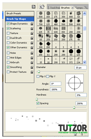
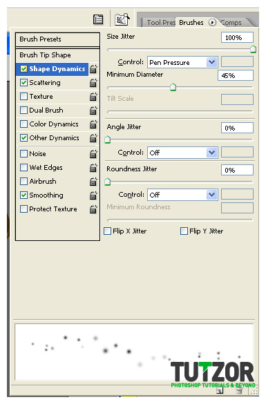
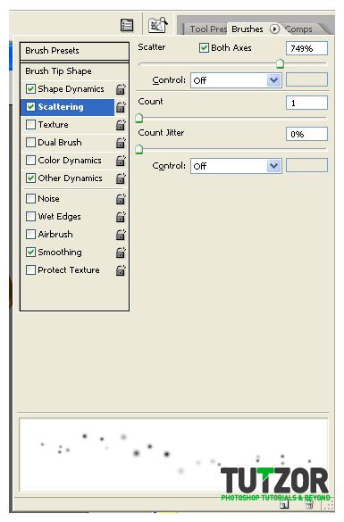
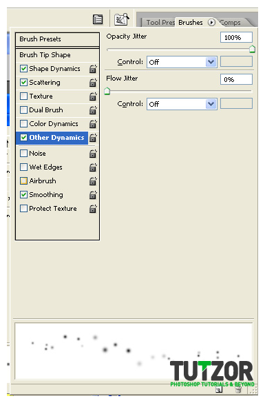


Step
43
Member since:
Mar 2011
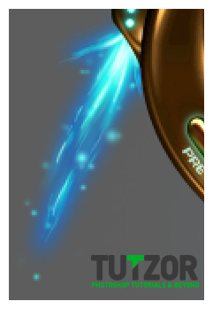
Brush a bit as to get a result similar to this:

Step
44
Member since:
Mar 2011
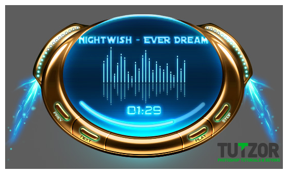
Duplicate the group, and flip it horizontally...and move so as to become the second booster :D
Then duplicate BOTH groups and merge these two copies into one layer, place it on top of the two booster-groups in the Layers Palette. Go to Filter-->Sharpen--->Sharpen two times, then place the layer on Lighten mode and lower its opacity to 70%.
Now you should have something like this:

Step
45
Member since:
Mar 2011
Just one more thing to do before we finsih, those blue boosters need to cast SOME sort of light on the gold don't they?
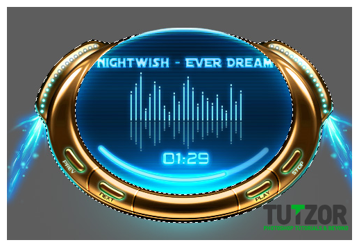
Open the "Body Player Group" group and and obtain a selection of the Body Player layer. Then Ctrl(Cmd)+Shift+click on the two "ears" layer thumbnail to add their selection to that of the player's body. Create a new layer above the Body Group.
Then set your Foreground color to #3fc3c7 and taking the Brush Tool, set it to a hard, round, about 15px size. Brush around the edges of the player, around the outer edges.
Like so:

Step
46
Member since:
Mar 2011
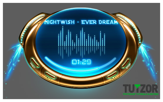
Okay, now set your layer to Linear Dodge mode and lower its Opacity to about 70%. Make sure you have deselected.
Now we should have somethinhg like this:

Step
47
Member since:
Mar 2011
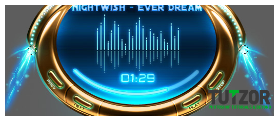
Next, create a new layer once again above this and set it to Color Dodge and Opacity to about 80%
Take a Soft, round brush of about 30px size and brush once on the left, once on the right, in the areas shown in the image below as selected 9see the two circular selections?)

Step
48
Member since:
Mar 2011
....well......we are..OMG done O___O
Hahaha.
Yeah we are done :)
Of course, many more stuffiez could still be added but hey! This is a good base, now you can add more stuff to it if you want...buuut I'm really tired and wanting some sleeeeep xD
Anyway, I really hope you've enjoyed the tutorial :)
If you hit trouble and/or want to show me your final result (I love seeing what people get from my tutorials, makes the whole time spent on one worthwhile hehehe ^__^) feel welcome to contact me via my DevArt account, http://seiorai.deviantart.com/ or my Facebook page: http://www.facebook.com/profile.php?id=100001907117980
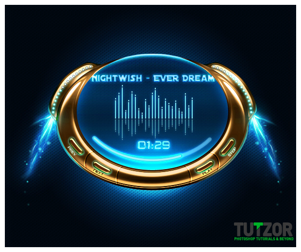
Here's a peek at the final result (yeah I added a background haha) :D
See yah! :)






Comments
Re: Create a Star Wars Themed Media Player - Part 2
yo yo ,
thank u ,
i got a new thing , u have the credit .
thank u .
Re: Create a Star Wars Themed Media Player
Thanks for the feedback,
we'll upload the psd, soon.
Cheers,
Joko
Re: Create a Star Wars Themed Media Player
hi,
thnx for the tutorial.. bt my output is not same like ur's.. so can u plz add download for the psd file of your tutorial so I cud check that where I ws wrong.
Thanx