Designing Custom Road Sign Icons Using Photoshop
23
Feb'12
 irenethompson80
Member since:
Feb 2012
Road signs today are more than just for the road. Look at all the different digital and printed designs out there and you will see a lot of them guiding people as they look through web pages, software interfaces and even for catalog printing, flyer printing and posters.
Final Image
Step
01
 irenethompson80
Member since:
Feb 2012
Road signs today are more than just for the road. Look at all the different digital and printed designs out there and you will see a lot of them guiding people as they look through web pages, software interfaces and even for catalog printing, flyer printing and posters. Now, you can easily download a lot of these road sign icons online, BUT I know that for many designers, it is always a better option to get one’s own design. This helps make your layout look a lot fresher and of course it is more original.
Luckily for you, it is not actually that hard to create custom road sign icons in Photoshop. There are a lot of built in shapes that you can exploit to easily setup the basic look. You can then just customize it with your own particular flourishes. In this guide, we will show you how you can do this yourself. Just follow through the steps and see.
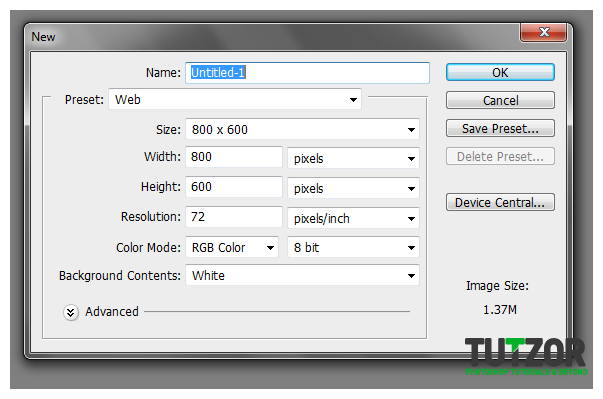
1. Open your Adobe Photoshop and create a new document for your road sign. The overall size depends on your use, but make sure you use higher resolution values if you are printing these signs (300ppi) while lower resolutions are best for web digital graphics (72ppi).

Step
02
 irenethompson80
Member since:
Feb 2012
2. Once done, click on OK. Now, let us add a background colour. Since these days, it is better to use a gradient than a pure colour, we will add a gradient to our background. First, choose you

Step
03
 irenethompson80
Member since:
Feb 2012
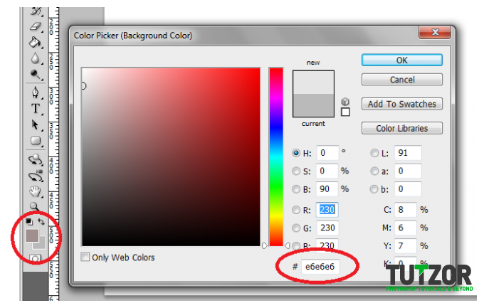
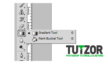
3. In our example we are doing to use the hex grey color #a1a1a1 for the foreground colours and e6e6e6 for the background colour. Once done, select the gradient tool in the tool window.

Step
04
 irenethompson80
Member since:
Feb 2012
4. Then, just drag the tool top to bottom to apply the gradient.


Step
05
 irenethompson80
Member since:
Feb 2012
5. Now you should see the gradient appear.


Step
06
 irenethompson80
Member since:
Feb 2012
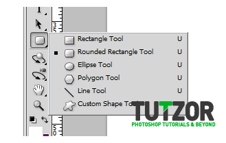
6. Great, now let us first create the base of our sign. Click first on the Rounded Rectangle Tool in your tools window.

Step
07
 irenethompson80
Member since:
Feb 2012
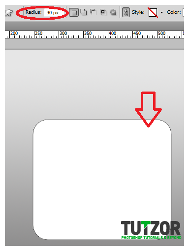
7. Now, look on top in your options bar, and select a radius of 30pixels for the rounded rectangle tool. Draw a perfectly symmetrical rounded rectangle by just dragging the tool outwards.

Step
08
 irenethompson80
Member since:
Feb 2012
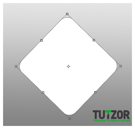
8. Then press CTRL+T and then rotate your rounded rectangle tool to get a good diamond shape. NOTE: depending on your simulation, you can also try the diamond custom shape tool. If you do not have that though, then use this method manual rotation method using the transform tool. Do not be afraid it should be ok.

Step
09
 irenethompson80
Member since:
Feb 2012
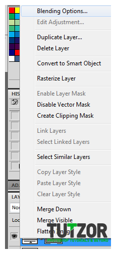
9. Afterwards, select the layer and click on “Blending Options”.

Step
10
 irenethompson80
Member since:
Feb 2012
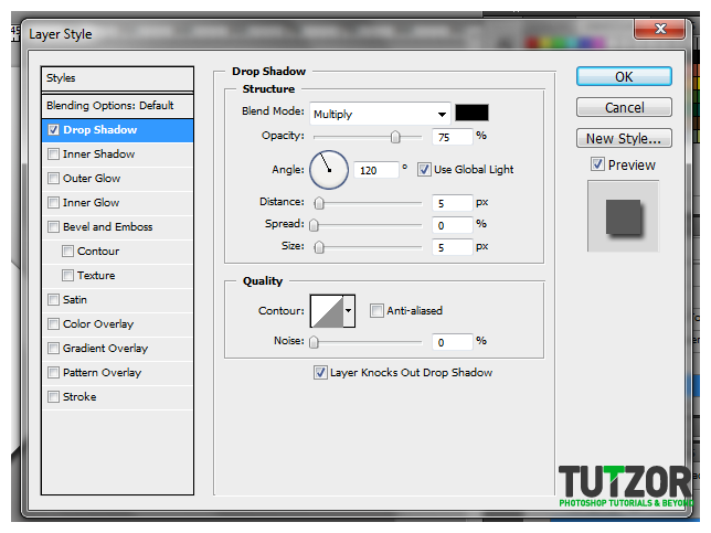
10. Once the layer options are open, first click the drop shadow option. Leave the rest of the controls on default.

Step
11
 irenethompson80
Member since:
Feb 2012
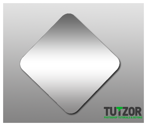
11. Next, tick the gradient overlay options, and use a 3 style gradient with dark edges and a white center like so. Once you are done, press OK.


Step
12
 irenethompson80
Member since:
Feb 2012
12. Now we have a metallic type base for our sign.

Step
13
 irenethompson80
Member since:
Feb 2012
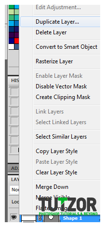
13. Next, duplicate this layer by right clicking on it and selecting duplicate layer...

Step
14
 irenethompson80
Member since:
Feb 2012
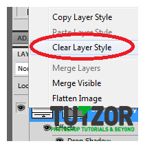
14. Afterwards, clear the layer’s style by right clicking on that new layer. This will let us customize this shape better.

Step
15
 irenethompson80
Member since:
Feb 2012
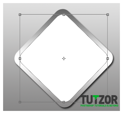
15. Then, resize this new layer so that it looks a bit like this:

Step
16
 irenethompson80
Member since:
Feb 2012
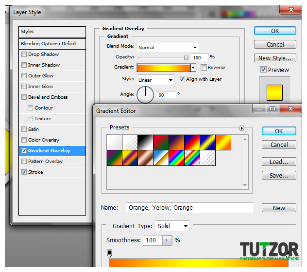
16. Once resized, click on the blending options once again of your sign. Tick of the gradient colour first, and decide on the proper design color combination that you want for your road sign. It is better to use bright hot colours such as Yellow, Orange and Red so that these sign icons look more visible.

Step
17
 irenethompson80
Member since:
Feb 2012
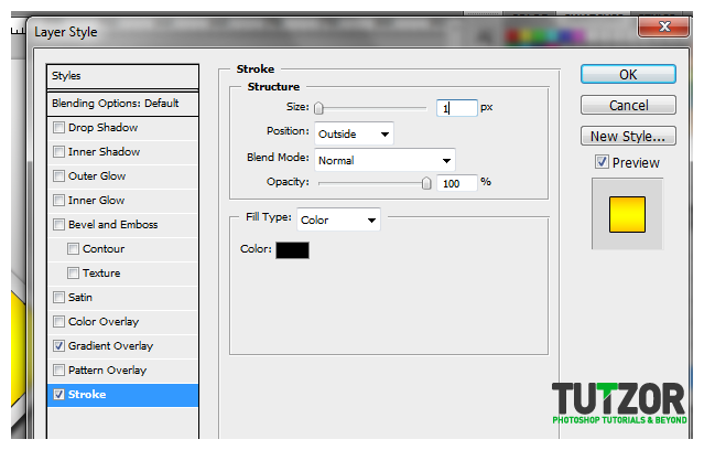
17. Now, Click on stroke and set a 1pixel black colour stroke.

Step
18
 irenethompson80
Member since:
Feb 2012
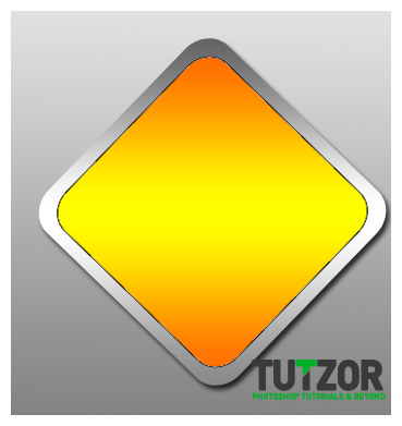
18. Once done, press OK.

Step
19
 irenethompson80
Member since:
Feb 2012
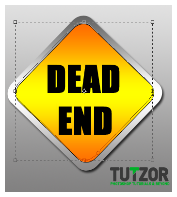
19. Now all you have to do is to add your road symbols. For this tutorial, we are just going to great a Dead end road signal. So just type in DEAD END, in your road sign.

Step
20
 irenethompson80
Member since:
Feb 2012
20. Just change up the text symbols you are using for different kinds of effects.


Step
21
 irenethompson80
Member since:
Feb 2012
Here are just a few more examples:


Step
22
 irenethompson80
Member since:
Feb 2012
Great! Now just customize your signs for your purpose. Good Luck!


