Design a colorful POP art poster in Photoshop
29
Apr'12
Member since:
Feb 2012
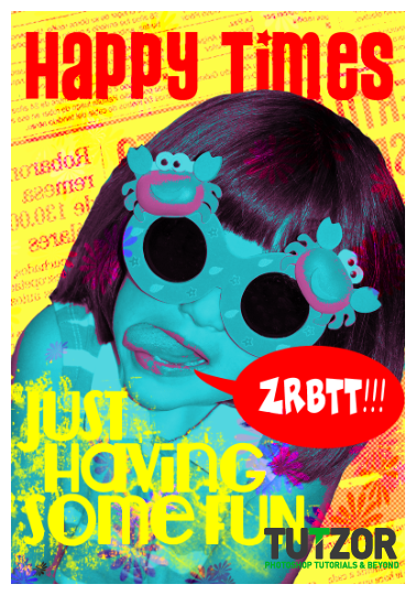
Pop, colorful art is always a theme that you can use for color posters, especially if you want a distinctly vogue or fashionable effect. In this tutorial, we will show you how you can turn your own Photographs into distinct works of colorful POP poster art. Just follow the easy steps listed below and you should have little trouble creating these festive designs.
Final Image
Step
01
Member since:
Feb 2012
Pop, colorful art is always a theme that you can use for color posters, especially if you want a distinctly vogue or fashionable effect. In this tutorial, we will show you how you can turn your own Photographs into distinct works of colorful POP poster art. Just follow the easy steps listed below and you should have little trouble creating these festive designs.
1. To start out colorful pop poster art, we of course setup the poster itself in a new document. The first task is to set the correct dimensions and resolution. For our purposes, we will be using an 11x17 inch poster dimension at 300ppi resolution for poster printing. We also changed the color mode to CMYK since the printer is using a four color type machine. You will want to determine exactly what your own printer needs for the best results for your posters.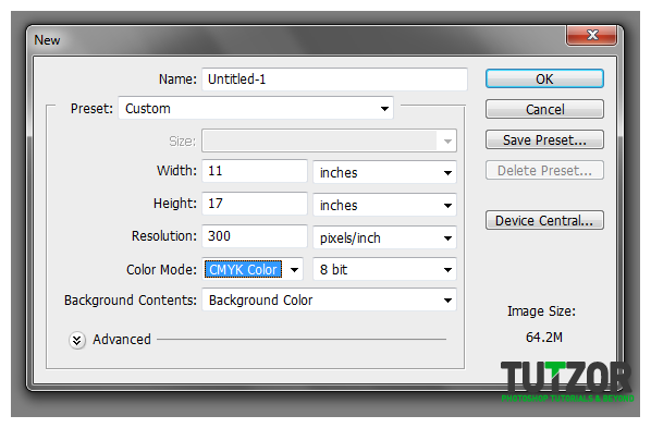
1. To start out colorful pop poster art, we of course setup the poster itself in a new document. The first task is to set the correct dimensions and resolution. For our purposes, we will be using an 11x17 inch poster dimension at 300ppi resolution for poster printing. We also changed the color mode to CMYK since the printer is using a four color type machine. You will want to determine exactly what your own printer needs for the best results for your posters.

Step
02
Member since:
Feb 2012
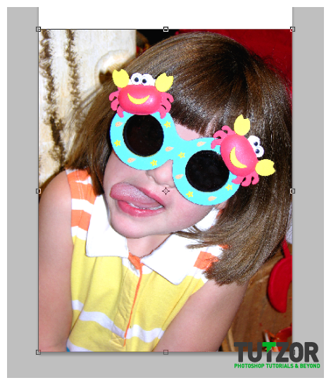
2. Once the document is now ready, we paste in the image that we want to use for our poster. In most cases, you will want to resize it to fit the dimensions. Just press CTRL+T to transform the image and increase or decrease its size depending on the needs. To constrain its proportions and keep the scaling pres and hold the shift key as you do the resize.

Step
03
Member since:
Feb 2012
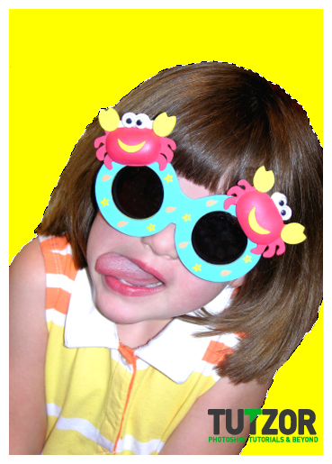
3. Then, we cut off the background from our cute little girl model and replace it with a fun bright yellow color.

Step
04
Member since:
Feb 2012
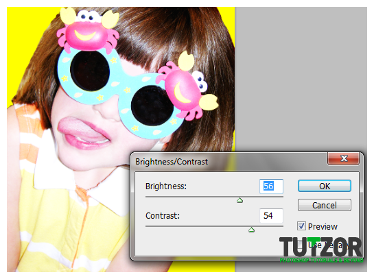
4. Now, we duplicate our model layer. Then we go to Image -> Adjustment -> Brightness/Contrast and adjust its levels a bit to be brighter.

Step
05
Member since:
Feb 2012
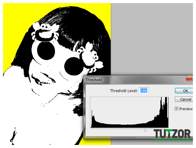
5. Next, go to Image -> Adjustment -> Threshold. Adjust it so that you get some great details of the face like so.

Step
06
Member since:
Feb 2012
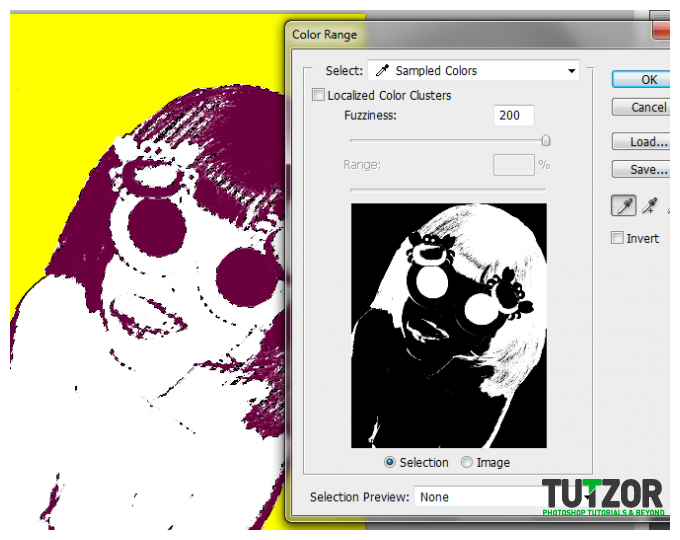
6. Next, go to Select -> Color Range… In the window that opens use the eye dropper tool to select ALL THE BLACK colors of this layer. Adjust the fuzziness as needed. Afterwards, paint a dark purples over the selection to change all black colors to that purple color.

Step
07
Member since:
Feb 2012
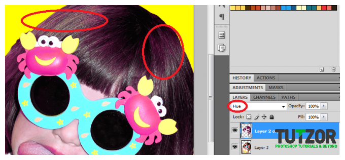
7. Then, invert the selection by pressing CTRL+SHIFT+I. Erase all the white layers. Then change the Blend mode of this layer to Hue. This will add some creative purple highlights to our model.

Step
08
Member since:
Feb 2012
8. Now, go to Image -> Adjustment -> Hue/Saturation. Adjust the levels to the values below to add a light blue effect to our main model while still maintaining the purple highlights above.
a. Hue: +184
b. Saturation: +70
c. Lightness -40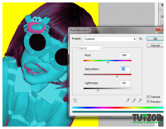
a. Hue: +184
b. Saturation: +70
c. Lightness -40

Step
09
Member since:
Feb 2012
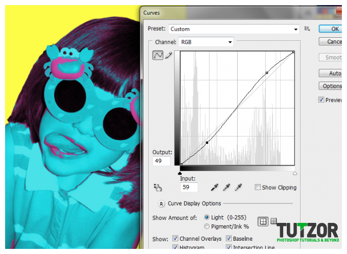
9. If you already like the colors for the model, you can now merge both the purple layer and the main model layer with hue and saturation. Do this by selecting both layers in the layer panel and clicking on “Merge Layers”. If you want, you can then adjust the lightness of your image more by going to Image –> Adjustment -> Curves and then altering the curve slightly like below.

Step
10
Member since:
Feb 2012
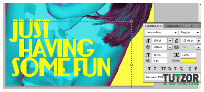
10. Now, let us type in some text. It is good to use a very stylistic font here, as our subject for the poster is pretty bright and fun. Whatever your font is, remember that you can adjust the line spacing, character spacing and tracking by looking at the characters panel. Here, we adjusted the line spacing so that it is a bit closer together, as well as the character spacing itself so that the text at this size fits our model image.

Step
11
Member since:
Feb 2012
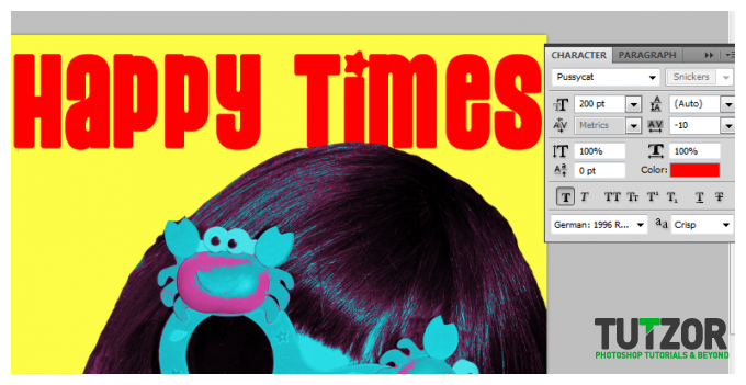
11. Next, we also add a red text title on top of our poster. Again adjust the text properties as needed.

Step
12
Member since:
Feb 2012
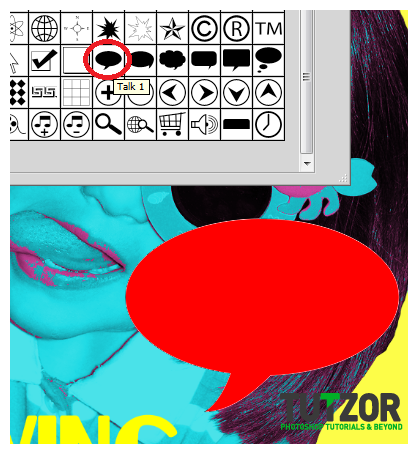
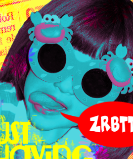
12. Next, using the custom shape tool, we create a callout talk shape to our design. We also use a red color for this to contrast with the bright yellow colors.

Step
13
Member since:
Feb 2012
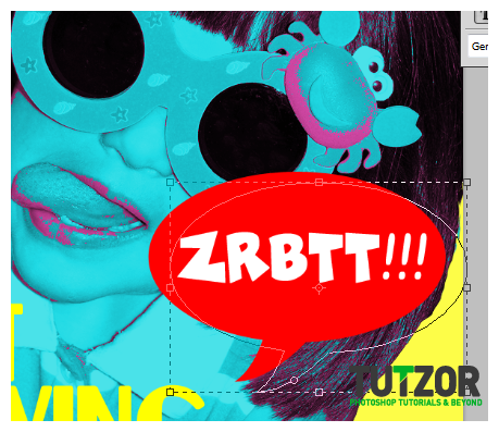
13. Then of course, we type in something our model might say. Here we used some Comics font styles for effect.

Step
14
Member since:
Feb 2012
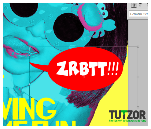
14. Afterwards, we rotate the text and callout shape appropriately.

Step
15
Member since:
Feb 2012
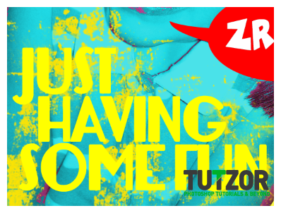
15. We add an extra layer above the yellow text by pressing CTRL+SHIFT+N. Then using a couple of grunge brushes in yellow color, we paint in some smudges and spills.

Step
16
Member since:
Feb 2012
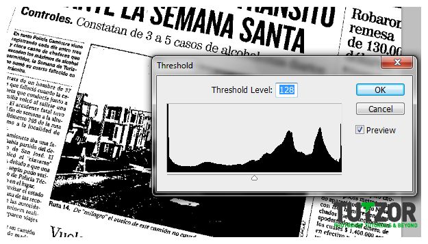
16. Before we finish up, we first add a little bit of texture to our background. On a separate image of a newspaper article, we adjust its threshold by going to Image –> Adjustments -> Threshold. Use a high value to get the text contrast up.

Step
17
Member since:
Feb 2012
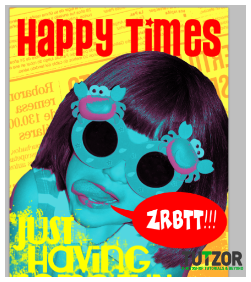
17. Then, using the same trick we did with the purple area, we selected the black parts, changed its color to a light red and then pasted it just behind our model layer as you see here.

Step
18
Member since:
Feb 2012
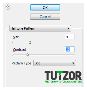
18. Then, apply a halftone pattern to this layer by going to filter -> Sketch ->Halftone pattern. Make sure that you use a read and light red color for foreground and background colors.

Step
19
Member since:
Feb 2012
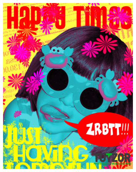
19. Now, create a new layer on top of all the other layers. Use a red color for your background and a pink color for your foreground. Using the Azalea brush in the brush options, we paint up some nice flowery spots across our design.

Step
20
Member since:
Feb 2012
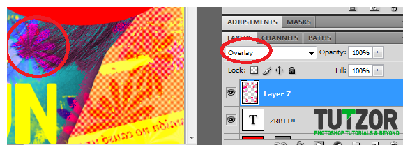
20. Finally, you can change the blend mode of this top most layer to “Overlay” to apply the creative color brushes unto our design.

Step
21
Member since:
Feb 2012
21. We then now have a great finished Pop style poster art design. Remember that you can also apply this effect to create awesome brochures or booklets.







Comments
Re: Design a colorful POP art poster in Photoshop